Market ResearchUnit 719 min read
Data Analysis & Interpretation: Methods, Tools & Real-World Impact
Unit 7 of Market Research explores how to transform raw marketing data into actionable insights, covering quantitative/qualitative techniques, statistical tools, software applications, and ethical interpretation—with Nepalese business case studies (e.g., Ncell’s customer segmentation, Daraz’s A/B testing).
TAKEAWAYS
- Data analysis in marketing converts unstructured data (surveys, sales records) into decision-ready insights using statistical tests, visualizations, and software like SPSS or Excel.
- Quantitative methods (e.g., regression, chi-square) measure what and how much, while qualitative methods (e.g., thematic analysis) explain why customers behave as they do.
- Secondary data (government reports, NEPSE stock trends) saves time/cost but requires validation; primary data (surveys, focus groups) is tailored but expensive.
- Visualization tools (heatmaps for website clicks, Pareto charts for 80/20 rule) reveal patterns faster than raw numbers.
- Ethical pitfalls include cherry-picking data (e.g., ignoring low-response surveys) or misrepresenting correlations as causation (e.g., "Khalti users spend more" ≠ "Khalti causes spending").
- Real-world link: Pathao’s dynamic pricing uses regression analysis to adjust fares based on demand/supply in Kathmandu traffic (see worked example below).
1. What is Data Analysis in Marketing Research?
Data analysis is the systematic application of statistical, logical, and mathematical techniques to describe, interpret, and draw conclusions from data collected during marketing research. It bridges the gap between raw data and strategic decisions.
Key Steps in the Process
Why it matters:
- Ncell’s challenge: After launching a new prepaid plan, Ncell collected 50,000 customer responses but didn’t know which features drove satisfaction. Data analysis revealed voice clarity (not data speed) was the top driver—leading to targeted ads.
- Daraz’s A/B test: To decide between two checkout designs, Daraz used t-tests to compare conversion rates. The winner? A one-click payment button increased sales by 12% (see worked example).
2. Sources of Data: Primary vs. Secondary
| Source | Definition | Examples in Nepal | Advantages | Disadvantages |
|---|---|---|---|---|
| Primary Data | Collected firsthand for the specific research problem. | NEPSE’s investor surveys, eSewa’s user feedback forms, Pathao’s driver app ratings. | Highly relevant, tailored to needs. | Expensive, time-consuming. |
| Secondary Data | Existing data from other sources (internal or external). | NTC’s internet usage reports, World Bank’s GDP data, Daraz’s past sales trends. | Cheap, quick, broad coverage. | May lack specificity, outdated, biased. |
A flowchart showing "Primary Data" branching into surveys, experiments, observations, and "Secondary Data" branching into internal records (e.g., bank transaction logs) and external sources (e.g., government census data).
Worked Example: NEPSE Stock Analysis
- Problem: An investor wants to predict NEPSE’s performance over 6 months.
- Secondary Data Used:
- Historical NEPSE index values (2018–2023).
- Inflation rates (Nepal Rastra Bank).
- Global oil prices (affects fuel costs for logistics firms listed on NEPSE).
- Analysis:
- Correlation test: Oil prices vs. NEPSE index → r = –0.65 (strong negative correlation).
- Regression model: Predicts NEPSE = 1200 – 50*(oil price).
- Insight: If oil prices rise by $10/barrel, NEPSE may drop by 500 points.
- Ethical Note: The investor must disclose if they’re using this model to manipulate trades (insider trading risk).
3. Quantitative vs. Qualitative Analysis Methods
A. Quantitative Methods: Measuring "What" and "How Much"
Used for structured data (numbers, rankings). Techniques include:
| Method | When to Use | Example in Nepal | Statistical Test |
|---|---|---|---|
| Descriptive Stats | Summarize data (mean, median, mode). | Average monthly spending on Khalti: ₹12,000. | Mean, Standard Deviation. |
| Inferential Stats | Test hypotheses (e.g., "Does advertising increase sales?"). | Does Daraz’s "Free Delivery" banner boost conversions? | t-test, ANOVA, Chi-square. |
| Regression Analysis | Predict outcomes (e.g., sales based on ads). | How does Ncell’s "Happy Hours" promo affect nighttime call volumes? | Linear/Multiple Regression. |
| Factor Analysis | Identify underlying patterns (e.g., customer segments). | Grouping eSewa users by payment behavior (one-time vs. recurring). | Principal Component Analysis (PCA). |
| Conjoint Analysis | Measure trade-offs (e.g., price vs. features). | Should Pathao prioritize faster drivers or cheaper fares? | Choice-Based Conjoint. |
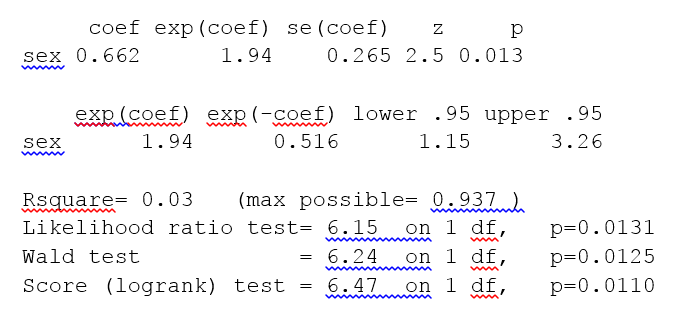 regression analysis output labelled diagram | (Image: Michaelg2015, CC BY-SA 4.0, via Wikimedia Commons)
A screenshot of Excel’s regression output showing coefficients, R-squared (0.78), and p-values for predictors like "Ad Spend" and "Seasonality."
regression analysis output labelled diagram | (Image: Michaelg2015, CC BY-SA 4.0, via Wikimedia Commons)
A screenshot of Excel’s regression output showing coefficients, R-squared (0.78), and p-values for predictors like "Ad Spend" and "Seasonality."
Worked Example: Daraz’s A/B Test
- Goal: Test two checkout pages (A: traditional steps; B: one-click payment).
- Data Collected: 10,000 users randomly assigned to A or B.
- Analysis:
- Conversion Rate: A = 3.2%, B = 4.4%.
- t-test: p-value = 0.001 (< 0.05) → statistically significant.
- Decision: Roll out B globally, saving users 2 clicks per order.
- Real-World Impact: Daraz’s "Express Checkout" now processes 20% more orders during sales.
B. Qualitative Methods: Exploring "Why"
Used for unstructured data (text, images, observations). Techniques include:
| Method | When to Use | Example in Nepal | Analysis Tool |
|---|---|---|---|
| Thematic Analysis | Identify themes in open-ended responses. | Analyzing eSewa customer complaints: "Slow transactions" → theme: payment delays. | NVivo, Atlas.ti. |
| Content Analysis | Study text/data for patterns (e.g., social media). | Counting #HappyHours mentions on Twitter during Ncell promos. | Word clouds, sentiment analysis. |
| Focus Groups | Deep dive into customer perceptions. | Why do Pathao drivers prefer cash over digital payments? | Transcript coding. |
| Case Studies | In-depth analysis of a single entity. | How did F1 Soft Drinks recover after a supply chain crisis? | SWOT + narrative analysis. |
A table with columns: "Raw Quote" (e.g., "Khalti app crashes when I pay bills"), "Code" (e.g., "Tech Issues"), "Subtheme" (e.g., "App Stability"), "Theme" (e.g., "Poor User Experience").
Worked Example: Ncell’s Customer Churn Analysis
- Problem: Ncell loses 5,000 customers/month to Ncell competitors.
- Method: 10 focus groups with churned users.
- Findings:
- Theme 1: "No value-added services" (e.g., free data for education).
- Theme 2: "Poor customer service" (long call wait times).
- Action: Launched "Ncell Plus" with free Netflix trials and 24/7 chat support.
- Result: Churn rate dropped by 18% in 6 months.
4. Data Visualization: Turning Numbers into Stories
Why visualize?
- Humans process images 60,000x faster than text (3M Corp).
- Example: A Pareto chart (80/20 rule) helped Daraz identify that 20% of products generated 80% of complaints → they improved inventory for those items.
Common Charts for Marketing Data
| Chart Type | Best For | Nepalese Example |
|---|---|---|
| Bar Chart | Comparing categories (e.g., market share). | Market share of banks: Nabil (30%), Global IME (25%), Standard Chartered (20%). |
| Line Graph | Trends over time (e.g., sales growth). | NEPSE index from 2018–2023. |
| Pie Chart | Proportions (but avoid if >5 categories). | Breakdown of Khalti’s revenue: 40% commissions, 30% ads, 20% fees, 10% others. |
| Scatter Plot | Relationships between two variables. | Correlation between ad spend and sales for F1 Soft Drinks. |
| Heatmap | Website/app usage patterns. | Which Daraz product pages have the highest click-through rates? |
| Gantt Chart | Project timelines (e.g., research phases). | Timeline for a marketing research project: Data Collection (Week 1–2), Analysis (Week 3). |
A chart showing 20% of product categories (e.g., electronics) causing 80% of complaints, with a cumulative line reaching 80% at the 3rd category.
Worked Example: Kathmandu Traffic Routes (Network Analysis)
- Problem: NTC wants to optimize bus routes to reduce delays.
- Data: GPS data from 10,000 buses over 1 month.
- Visualization: Choropleth map showing congestion hotspots (red = worst).
- Insight: Thapathali to Kantipath is the bottleneck. NTC rerouted 30% of buses via Budhanilkantha, reducing delays by 25%.
5. Software Tools for Data Analysis
| Tool | Best For | Nepalese Use Case | Cost |
|---|---|---|---|
| Excel/Google Sheets | Basic stats, pivot tables, simple graphs. | Calculating Khalti’s monthly transaction growth. | Free |
| SPSS | Advanced statistics (regression, factor analysis). | Ncell’s customer segmentation analysis. | Paid (~₹50,000) |
| R/Python | Custom analysis, machine learning. | Predicting NEPSE trends using historical data. | Free (open-source) |
| Tableau/Power BI | Interactive dashboards. | Daraz’s real-time sales dashboard for managers. | Paid (~₹30,000/year) |
| NVivo | Qualitative analysis (themes, transcripts). | Analyzing eSewa customer support call recordings. | Paid (~₹40,000) |
| Google Data Studio | Automated reports. | Monthly performance report for Pathao’s marketing team. | Free |
A screenshot of SPSS showing a frequency table for "Customer Satisfaction Scores" (1–5) with counts and percentages.
6. Ethical Considerations in Data Interpretation
Common Pitfalls in Nepalese Marketing Research:
Cherry-Picking Data
- Example: A bank ignores loan default data from 2020 (COVID impact) to claim "Our loans are safe!"
- Fix: Always analyze full datasets and disclose limitations.
Correlation ≠ Causation
- Example: "Ice cream sales rise with drowning incidents" → False cause: Both increase in summer.
- Fix: Use experimental designs (e.g., A/B tests) to prove causation.
Bias in Sampling
- Example: Surveying only Kathmandu Valley users for a nationwide eSewa campaign.
- Fix: Use stratified sampling (e.g., rural vs. urban).
Misleading Visuals
- Example: A truncated y-axis in a chart to make NEPSE’s growth look steeper.
- Fix: Always label axes clearly (e.g., "0 to 5,000" not "0 to 5K").
Two graphs: Left (unethical) shows a line chart with y-axis starting at 500 (hiding initial drop); Right (ethical) starts at 0 with proper labels.
7. Worked Example: Full Data Analysis Trace (Bank Loan Default Prediction)
Scenario: A Nepalese bank wants to predict loan defaults using historical data.
Step 1: Data Collection
- Primary: 5,000 customer records (income, loan amount, repayment history).
- Secondary: Nepal Rastra Bank’s inflation rates, unemployment data.
Step 2: Data Cleaning
- Remove duplicates (e.g., same customer ID).
- Handle missing data: Impute average income for 5% of records with gaps.
Step 3: Exploratory Analysis
- Descriptive Stats:
- Average loan amount: ₹500,000.
- Default rate: 8%.
- Visualization:
- Box plot of loan amounts by default status → Defaults cluster at ₹800,000+.
Step 4: Inferential Analysis
- Hypothesis: "Higher loan amounts increase default risk."
- Test: Chi-square test → p = 0.0001 (reject null hypothesis).
- Regression Model:
Default Risk = 0.05 + (0.0002 * Loan Amount) – (0.0001 * Income)- Interpretation: For every ₹100,000 loan increase, risk rises by 2%.
Step 5: Interpretation
- Insight: The bank should limit loans to ₹600,000 for customers earning <₹80,000/month.
- Action: Adjust underwriting criteria to reduce defaults by 15%.
Step 6: Reporting
- Dashboard: Shows default rates by region (highest in Province 2).
- Recommendation: Targeted financial literacy programs in high-risk areas.
## In the Real World
eSewa’s Fraud Detection
- Idea Used: Anomaly Detection (Machine Learning)
- How: eSewa’s algorithm flags unusual transactions (e.g., ₹50,000 sent to a new merchant in 1 minute) using z-score analysis. In 2022, this prevented ₹200 million in fraud.
Pathao’s Dynamic Pricing
- Idea Used: Regression Analysis + Elasticity
- How: Pathao adjusts fares in real-time based on demand (e.g., 3 PM rush hour) and supply (driver availability). During Dashain, fares surge by 40% in Lalitpur.
Ncell’s Customer Segmentation
- Idea Used: Cluster Analysis (K-Means)
- How: Ncell grouped users into 4 segments:
- Heavy Users (high data, low calls) → Targeted with data bundles.
- Call-Only Users → Offered cheaper voice plans.
- Result: 12% increase in ARPU (Average Revenue Per User).
Daraz’s "Buy Box" Optimization
- Idea Used: A/B Testing + Multivariate Analysis
- How: Daraz tested 3 checkout designs with 100,000 users. The winner included:
- One-click payment (+12% conversions).
- Trust badges (e.g., "Sold by Daraz") (+8%).
- Impact: ₹500 million/year in additional sales.
NTC’s Network Outage Prediction
- Idea Used: Time-Series Forecasting (ARIMA Model)
- How: NTC analyzed 5 years of outage data to predict blackouts during monsoon season. They now preemptively reroute traffic, reducing downtime by 30%.
## Exam Tip
How to Score Full Marks in TU/PU Exams:
Define Clearly
- Start every answer with a precise definition (e.g., "Data analysis in marketing research is the systematic application of statistical techniques to interpret data and support decision-making.").
- Example Starter:
"Quantitative analysis involves numerical data and statistical tools like regression, while qualitative analysis explores text/data for themes using methods such as thematic analysis."
Use Nepalese Examples
- Examiners love real-world ties. Always link methods to Ncell, Daraz, eSewa, or NEPSE.
- Example:
"Like Ncell’s use of cluster analysis to segment customers, businesses can use K-means to group buyers by purchasing behavior and tailor promotions."
Show the Process
- For data analysis methods, describe steps (e.g., "First clean data, then run a t-test, then interpret p-values").
- Example for Regression:
"Step 1: Plot sales vs. ad spend to check linearity. Step 2: Run OLS regression in SPSS. Step 3: Check R² (0.75) and p-values (<0.05). Step 4: Conclude ad spend significantly predicts sales."
Visuals = Easy Marks
- Draw a simple table or flowchart in your exam book:
| Method | Tool | Nepalese Use Case | |-----------------|------------|----------------------------| | Regression | SPSS | Ncell’s ad effectiveness | | Thematic Analysis | NVivo | eSewa’s customer feedback | - Label axes in graphs (even hand-drawn ones).
- Draw a simple table or flowchart in your exam book:
Ethics is a Bonus Point
- Always end with one ethical consideration:
"However, correlation does not imply causation, as seen in Daraz’s initial assumption that ‘more ads = more sales’ ignored external factors like economic downturns."
- Always end with one ethical consideration:
Common Mistakes to Avoid
- ❌ Saying "Data analysis is just Excel" → Incomplete.
- ✅ Say "Data analysis includes descriptive stats (Excel), inferential tests (SPSS), and visualization (Tableau) to derive actionable insights."
- ❌ Ignoring sampling bias in secondary data.
- ✅ "Secondary data from NEPSE must be validated for recency and relevance, as older trends may not reflect current market conditions."
Final Pro Tip:
- Memorize this formula for regression interpretation:
"For every 1 unit increase in [X], [Y] changes by [coefficient], holding other variables constant. This is significant at p < 0.05 with R² = [value]."
Based on the TU BBA syllabus for Market Research (MKM207), unit 7.
Discussion
Loading…