Web TechnologyUnit 213 min read
CSS: Styling, Layouts & Box Model (Themes, Selectors, Positioning)
Unit 2 of Web Technology covers CSS fundamentals—how to style HTML elements, create responsive layouts, and master the CSS Box Model. Learn types of CSS (inline, internal, external), selectors, properties, and real-world responsive design techniques with hands-on examples.
TAKEAWAYS:
- CSS controls presentation (colors, fonts, spacing) while HTML defines structure.
- The Box Model (content + padding + border + margin) is the foundation of every layout.
- Selectors (ID, class, element) target elements for styling; specificity determines which rule applies.
- Responsive design uses media queries and flexible units (%, vw, flexbox) to adapt to screens.
- External CSS (linked via
<link>) is the best practice for maintainability and reuse. - Positioning (static, relative, absolute, fixed) controls element placement in the document flow.
1. What is CSS?
CSS (Cascading Style Sheets) is a styling language used to control the visual presentation of HTML elements. While HTML defines the structure of a webpage (e.g., headings, paragraphs, lists), CSS defines how those elements look (e.g., colors, fonts, spacing, layout).
Why Use CSS?
- Separation of concerns: Keeps HTML clean and maintainable.
- Reusability: Apply styles to multiple pages via external stylesheets.
- Responsive design: Adapts layouts to different screen sizes (mobile, tablet, desktop).
- Animations and effects: Adds interactivity without JavaScript.
How CSS Works
CSS works by selecting HTML elements and applying properties to them. For example:
<p style="color: blue; font-size: 16px;">This is a styled paragraph.</p>
Here, color and font-size are CSS properties, and blue and 16px are their values.
2. Types of CSS
CSS can be applied in three ways:
| Type | Definition | Example | Use Case |
|---|---|---|---|
| Inline CSS | Styles applied directly to an HTML element using the style attribute. |
<p style="color: red;">Red text</p> |
Quick overrides (e.g., fixing a typo). |
| Internal CSS | Styles defined in the <head> section of an HTML file using <style> tags. |
<style> p { color: blue; } </style> |
Single-page styling. |
| External CSS | Styles stored in a separate .css file and linked to HTML using <link>. |
<link rel="stylesheet" href="styles.css"> |
Large websites (best practice). |
Which One to Use?
- Inline CSS: Avoid unless necessary (e.g., debugging).
- Internal CSS: Use for small projects or prototypes.
- External CSS: Best practice for professional websites (reusable, easier maintenance).
3. The CSS Box Model
Every HTML element is a box with four key components:
Visualization:
+---------------------+
|        Margin       |
+---------------------+
|        Border       |
+---------------------+
|        Padding      |
+---------------------+
|       Content       |
+---------------------+
Box Model Properties
| Property | Description | Example |
|---|---|---|
width |
Sets the width of the content area. | width: 200px; |
height |
Sets the height of the content area. | height: 100px; |
padding |
Space between content and border. | padding: 10px; |
border |
Outline around the padding. | border: 2px solid black; |
margin |
Space outside the border. | margin: 20px; |
box-sizing |
Controls whether width/height include padding/border (border-box). |
box-sizing: border-box; |
Worked Example: Box Model in Action
Task: Create a button with:
- Content: "Click Me"
- Padding: 10px
- Border: 2px solid red
- Margin: 15px
- Total width: 120px (including padding and border)
<button style="
  width: 120px;
  padding: 10px;
  border: 2px solid red;
  margin: 15px;
  box-sizing: border-box;
">
  Click Me
</button>
Result:
- The content width will be
120px - (10px padding × 2) - (2px border × 2) = 96px. box-sizing: border-boxensures the total width (content + padding + border) is120px.
4. CSS Selectors
Selectors target HTML elements to apply styles. Common selectors:
| Selector | Example | Description |
|---|---|---|
| Element | p { color: red; } |
Targets all <p> elements. |
| Class | .btn { ... } |
Targets elements with class="btn". |
| ID | #header { ... } |
Targets the element with id="header" (unique per page). |
| Attribute | input[type="text"] |
Targets inputs with type="text". |
| Descendant | div p { ... } |
Targets <p> inside <div>. |
| Pseudo-class | a:hover { ... } |
Targets <a> when hovered. |
Specificity Rules
CSS applies the most specific rule. Order of priority:
- Inline styles (highest priority).
- ID selectors (
#id). - Class/attribute selectors (
.class,[type]). - Element selectors (lowest priority).
Example:
/* ID has higher specificity than class */
#main { color: blue; }
.btn { color: red; }
If an element has both id="main" and class="btn", it will be blue (ID wins).
5. CSS Layout Techniques
A. Flexbox (Flexible Box Layout)
Flexbox simplifies 1D layouts (rows or columns). Key properties:
display: flex;→ Enables flexbox.flex-direction: row|column;→ Arranges items horizontally/vertically.justify-content: center|space-between;→ Aligns items along the main axis.align-items: center|flex-start;→ Aligns items along the cross axis.
Example: Two-Column Layout (25%/75%)
<div style="display: flex;">
  <div style="width: 25%; background: lightgray;">Sidebar</div>
  <div style="width: 75%; background: lightblue;">Main Content</div>
</div>
B. Grid Layout
CSS Grid handles 2D layouts (rows and columns). Key properties:
display: grid;→ Enables grid.grid-template-columns: 1fr 2fr;→ Defines column widths.grid-gap: 10px;→ Adds spacing between items.
Example: Responsive Grid
.container {
  display: grid;
  grid-template-columns: repeat(auto-fit, minmax(200px, 1fr));
  gap: 10px;
}
C. Positioning
Controls where elements appear:
static(default): Follows document flow.relative: Offsets from normal position (does not affect other elements).absolute: Positions relative to nearest positioned ancestor.fixed: Stays in place even when scrolling.
Example: Sticky Header
header {
  position: sticky;
  top: 0;
  background: white;
}
6. Responsive Design with Media Queries
Media queries adapt styles for different screen sizes. Syntax:
@media (max-width: 600px) {
  body { font-size: 14px; }
}
Example: Mobile-First Design
/* Default (mobile) */
body { font-size: 16px; }

/* Tablet */
@media (min-width: 768px) {
  body { font-size: 18px; }
}

/* Desktop */
@media (min-width: 1024px) {
  body { font-size: 20px; }
}
7. Font-Related Attributes
CSS controls typography with:
| Property | Example | Description |
|---|---|---|
font-family |
font-family: Arial; |
Sets the font. Use fallbacks: font-family: Arial, sans-serif; |
font-size |
font-size: 16px; |
Sets text size (use rem/em for scalability). |
font-weight |
font-weight: bold; |
Makes text bold (400 = normal, 700 = bold). |
text-align |
text-align: center; |
Aligns text (left, right, center, justify). |
line-height |
line-height: 1.5; |
Increases spacing between lines. |
Example: Stylish Heading
h1 {
  font-family: 'Roboto', sans-serif;
  font-size: 2.5rem;
  font-weight: 700;
  text-align: center;
  line-height: 1.2;
}
8. CSS vs. XSL
| Feature | CSS | XSL (XSLT) |
|---|---|---|
| Purpose | Styles HTML content. | Transforms XML to other formats (HTML, text, etc.). |
| Usage | Web design. | Data processing (e.g., converting XML to HTML). |
| Example | p { color: red; } |
<xsl:template match="book">...</xsl:template> |
| Output | Visual styling. | New XML/HTML document. |
In the Real World
eSewa (Nepal):
- Uses CSS Grid/Flexbox for its responsive payment forms (works on mobile and desktop).
- Media queries adjust button sizes and font scales for small screens.
Khalti Checkout Page:
- External CSS ensures consistent styling across all payment pages.
- Box Model controls spacing between input fields and the "Pay Now" button.
Daraz Product Page:
- Flexbox arranges product images, price, and "Add to Cart" button in a single row.
- Responsive design stacks images and text vertically on mobile.
NTC Website:
- CSS Grid organizes service links (Internet, Mobile, Landline) in a clean layout.
- Pseudo-classes (
:hover) highlight links when users mouse over them.
Bank Loan Calculators (e.g., NMB, Global IME):
- Inline styles dynamically update interest rate displays when users change inputs.
- External CSS ensures the calculator’s design matches the bank’s branding.
Worked Example: Real-World Layout (Nepalese Bank Website)
Task: Design a bank’s loan interest calculator with:
- A header (logo + search bar).
- A two-column layout (left: loan details, right: calculator).
- A footer with contact info.
Solution:
<!DOCTYPE html>
<html>
<head>
  <style>
    /* External CSS (best practice) */
    body { font-family: Arial, sans-serif; margin: 0; }
    header { background: #003366; color: white; padding: 10px; }
    .container { display: flex; max-width: 1200px; margin: 20px auto; }
    .sidebar { width: 25%; background: #f4f4f4; padding: 10px; }
    .content { width: 75%; padding: 20px; }
    footer { text-align: center; padding: 10px; background: #333; color: white; }
    @media (max-width: 768px) {
      .container { flex-direction: column; }
    }
  </style>
</head>
<body>
  <header>
    <img src="bank-logo.png" alt="Bank Logo" style="height: 50px;">
    <input type="text" placeholder="Search loans..." style="margin-left: 20px; padding: 5px;">
  </header>
  <div class="container">
    <div class="sidebar">
      <h3>Loan Types</h3>
      <ul>
        <li>Home Loan</li>
        <li>Car Loan</li>
        <li>Personal Loan</li>
      </ul>
    </div>
    <div class="content">
      <h2>Loan Calculator</h2>
      <input type="number" placeholder="Loan Amount" style="width: 100%; padding: 8px;">
      <input type="number" placeholder="Interest Rate (%)" style="width: 100%; padding: 8px; margin-top: 10px;">
      <button style="width: 100%; padding: 10px; background: #003366; color: white;">Calculate</button>
    </div>
  </div>
  <footer>
    <p>Contact: 01-1234567 | support@bank.com</p>
  </footer>
</body>
</html>
Key Techniques Used:
- Flexbox for the two-column layout.
- Media query to stack columns on mobile.
- External CSS (in
<style>here; in practice, use a separate.cssfile). - Box Model for padding and margins.
Exam Tip
- Always use external CSS in exams unless asked otherwise (shows professionalism).
- Draw the Box Model when explaining layout issues (examiners love diagrams!).
- Practice responsive design with media queries—this is a high-weightage topic.
- Memorize selector specificity (ID > Class > Element) and test with examples.
- For layout questions, use:
- Flexbox for rows/columns.
- Grid for complex 2D layouts.
- Positioning (
relative/absolute) for overlays (e.g., modals).
- Common pitfalls:
- Forgetting
box-sizing: border-box;(leads to unexpected widths). - Not resetting margins/padding (use
margin: 0;on<body>). - Overusing
!important(avoid unless necessary).
- Forgetting
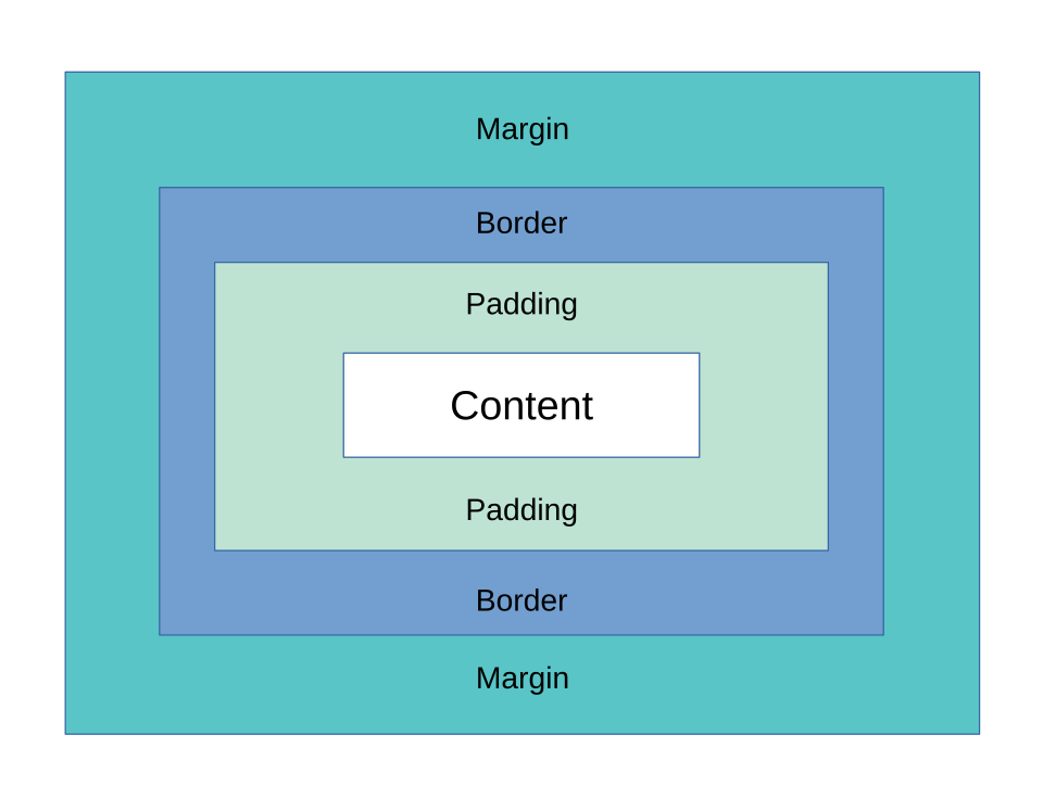 A labeled illustration showing content, padding, border, and margin layers. (Image: Charles Calvert, CC BY-SA 4.0, via Wikimedia Commons)
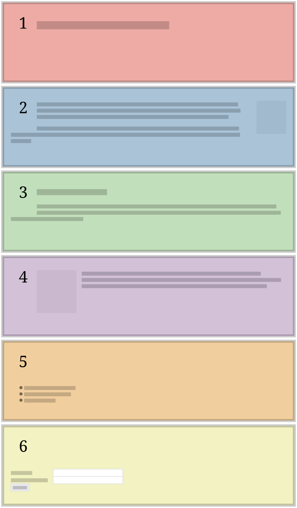 A grid with defined rows and columns, showing item placement. (Image: Hunsvotti, CC BY-SA 4.0, via Wikimedia Commons)
Based on the TU BCA syllabus for Web Technology (CACS205), unit 2.
Discussion
Loading…