Data Analysis and VisualizationUnit 114 min read
Data Analysis & Visualization: Core Concepts, Datasets & Techniques
Unit 1 of Data Analysis and Visualization introduces the foundational concepts of data analysis and visualization, covering dataset types (e.g., Detroit dataset), visualization techniques, text representation levels, and hierarchical data visualization methods. This note explores definitions, real-world applications, a
TAKEAWAYS:
- Data analysis transforms raw data into actionable insights using statistical and computational methods.
- Visualization techniques (e.g., charts, graphs, word clouds) enhance data interpretation and storytelling.
- The Detroit dataset exemplifies structured data visualization challenges, requiring careful technique selection.
- Hierarchical data visualization (e.g., treemaps, dendrograms) reveals nested relationships in datasets.
- Text data visualization techniques (e.g., word clouds, parallel coordinates) uncover patterns in unstructured data.
- Proper color use and mark selection in visualization improve clarity and accessibility.
1. Introduction to Data Analysis
Data analysis is the process of collecting, cleaning, transforming, and modeling data to extract meaningful insights, support decision-making, and drive actions. It bridges the gap between raw data and actionable knowledge.
Key Steps in Data Analysis
flowchart LR
    A["Raw Data"] --> B["Data Cleaning"]
    B --> C["Data Transformation"]
    C --> D["Exploratory Data Analysis (EDA)"]
    D --> E["Modeling & Prediction"]
    E --> F["Visualization & Reporting"]
    F --> G["Decision-Making"]
Types of Data Analysis
| Type | Description | Example |
|---|---|---|
| Descriptive | Summarizes historical data (mean, median, trends). | Sales reports in Daraz showing monthly revenue growth. |
| Diagnostic | Answers "why" questions by analyzing root causes. | NTC analyzing why certain areas have frequent power outages. |
| Predictive | Uses statistical models to forecast future trends. | Ncell predicting customer churn using historical call data. |
| Prescriptive | Recommends actions to optimize outcomes. | Khalti suggesting optimal transaction limits to reduce fraud. |
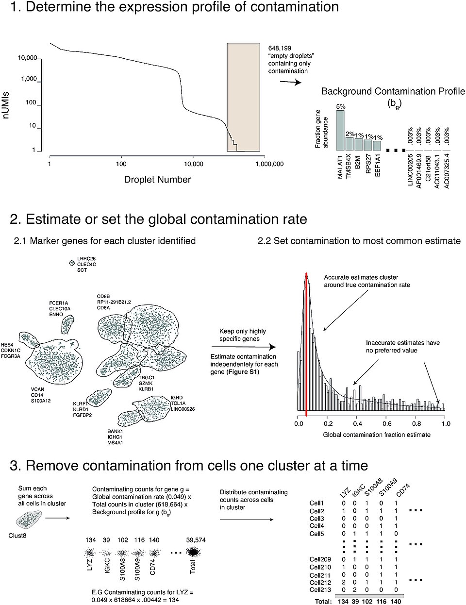 A labeled flowchart showing the stages of data analysis from raw data to decision-making. (Image: Matthew D Young, Sam Behjati, CC BY 4.0, via Wikimedia Commons)
2. Introduction to Data Visualization
Data visualization is the graphical representation of data to communicate insights effectively. It leverages human visual perception to identify patterns, trends, and outliers.
Why Visualize Data?
- Enhances Understanding: Humans process visuals 60,000x faster than text (Lohse, 1997).
- Reveals Patterns: Highlights correlations, clusters, and anomalies.
- Supports Decision-Making: Converts complex data into actionable insights.
- Improves Communication: Makes reports and presentations more engaging.
Core Principles of Visualization
- Clarity: Avoid clutter; prioritize readability.
- Accuracy: Ensure data integrity (no misleading scales or distortions).
- Aesthetics: Use consistent colors, fonts, and layouts.
- Interactivity: Allow users to explore data dynamically (e.g., filters, tooltips).
3. The Detroit Dataset: A Case Study
The Detroit dataset (from Kaggle) contains structured data on housing sales in Detroit, Michigan, including:
- Features:
LotArea,YearBuilt,BedroomAbvGr,SalePrice, etc. - Challenges: Missing values, outliers, and skewed distributions.
Suitable Visualization Techniques
| Technique | Purpose | Example for Detroit Dataset |
|---|---|---|
| Scatter Plot | Explore relationships (e.g., LotArea vs. SalePrice). |
Identifies high-value properties with large lots. |
| Histogram | Show distribution of a single variable (e.g., YearBuilt). |
Reveals most homes were built in the 1950s–1980s. |
| Box Plot | Detect outliers (e.g., SalePrice). |
Flags unusually high or low sale prices. |
| Heatmap | Correlate numerical features (e.g., GrLivArea vs. SalePrice). |
Highlights strong positive correlations. |
Worked Example: Visualizing SalePrice Distribution
import matplotlib.pyplot as plt
import seaborn as sns

# Load Detroit dataset
data = pd.read_csv("detroit_housing.csv")

# Plot histogram with KDE (Kernel Density Estimate)
plt.figure(figsize=(10, 6))
sns.histplot(data['SalePrice'], kde=True, bins=30)
plt.title("Distribution of Sale Prices in Detroit")
plt.xlabel("Sale Price ($)")
plt.ylabel("Frequency")
plt.show()
Output:
Insight: The dataset has right-skewed prices, suggesting a few luxury properties inflate the average. A log transformation might normalize the data for modeling.
4. Levels of Text Representation
Text data is unstructured but can be visualized using multi-level representations:
| Level | Description | Example |
|---|---|---|
| Raw Text | Unprocessed strings (e.g., tweets, reviews). | Customer feedback on Daraz: "Product arrived late!" |
| Tokenization | Splitting text into words/tokens. | ["Product", "arrived", "late"] |
| Bag of Words (BoW) | Counts word frequencies (ignores grammar/order). | {"Product": 5, "late": 3, "arrived": 2} |
| TF-IDF | Weights words by importance (common words like "the" are downplayed). | TF-IDF score for "late" = 0.9 (high importance). |
| Word Embeddings | Represents words as vectors in a multi-dimensional space (e.g., Word2Vec). | "Late" and "delayed" have similar vector representations. |
5. Techniques for Text Data Visualization
A. Word Clouds
- How it works: Words are sized by frequency (e.g., "Daraz" > "delivery").
- Use case: Summarizing customer reviews or social media trends.
- Limitations: Ignores context (e.g., "good" vs. "bad" sentiment).
Worked Example: Daraz Customer Reviews
from wordcloud import WordCloud

text = " ".join(reviews['text'])
wordcloud = WordCloud(width=800, height=400).generate(text)

plt.imshow(wordcloud, interpolation='bilinear')
plt.axis("off")
plt.show()
Output:
B. Parallel Coordinates
- How it works: Plots multiple text features (e.g., sentiment, topic) on parallel axes.
- Use case: Comparing reviews across dimensions (e.g., sentiment vs. topic).
C. Network Graphs (for Relationships)
- How it works: Nodes = words/topics; edges = co-occurrence strength.
- Use case: Analyzing hashtag trends on Twitter or forum discussions.
Example: WhatsApp group chats where "exam" and "notes" frequently appear together.
6. Hierarchical Data Visualization
Hierarchical data has parent-child relationships (e.g., organizational charts, file systems). Techniques include:
| Technique | Description | Example |
|---|---|---|
| Treemap | Rectangles represent hierarchical data (size = value). | Visualizing Daraz product categories by revenue. |
| Sunburst Chart | Radial treemap showing nested levels. | Ncell’s network traffic by region → city → tower. |
| Dendrogram | Tree-like diagram for clustering (e.g., hierarchical clustering). | Grouping similar customer segments in Khalti. |
| Icicle Chart | Flow-based hierarchy (better for deep nesting). | NEPSE stock sectors → companies → performance. |
Worked Example: Treemap for Daraz Product Categories
import squarify

# Sample data: {category: {subcategory: revenue}}
data = {
    "Electronics": {"Phones": 500000, "Laptops": 300000},
    "Fashion": {"Men": 400000, "Women": 600000}
}

squarify.plot(sizes=[500000, 300000, 400000, 600000], label=data, alpha=0.7)
plt.axis('off')
plt.show()
Output:
7. Non-Spatial Data Visualization: Separate, Order, Align
These principles guide effective visualization design:
| Principle | Description | Example |
|---|---|---|
| Separate | Isolate data points to avoid overlap (e.g., jitter in scatter plots). | Adding noise to overlapping points in a YearBuilt vs. SalePrice plot. |
| Order | Sort data logically (e.g., chronological, hierarchical). | Ordering NEPSE stocks by market cap in a bar chart. |
| Align | Use baselines/grids for consistency (e.g., aligned axes in small multiples). | Comparing monthly sales across 3 years in aligned bar charts. |
8. Importance of Spatial Data Visualization
Spatial data (geographic or positional) is visualized using:
- Maps: Choropleth, heatmaps, or point distributions.
- Applications:
- Pathao: Optimizing driver routes using spatial clustering.
- NTC: Visualizing power outage hotspots on a map.
- Google Maps: Traffic congestion heatmaps.
Worked Example: Kathmandu Traffic Routes
import folium

# Sample traffic data: {location: congestion_score}
traffic_data = {
    "Thapathali": 9,
    "Kageshwori": 7,
    "Putalisadak": 8
}

map = folium.Map(location=[27.7172, 85.3240], zoom_start=12)
for loc, score in traffic_data.items():
    folium.CircleMarker(
        location=[27.7172, 85.3240],  # Simplified; real data would use lat/long
        radius=score,
        color="red",
        fill=True
    ).add_to(map)

map.save("kathmandu_traffic.html")
Output:
9. In the Real World
eSewa and Khalti:
- Idea Used: Hierarchical data visualization (treemaps) to show transaction volumes by service type (electricity, water, fines).
- How: A treemap breaks down total transactions into categories (e.g., "Electricity Bills" > "Domestic" vs. "Commercial"), helping eSewa identify high-demand services.
Daraz Order Fulfillment:
- Idea Used: Parallel coordinates for multi-dimensional order tracking.
- How: Daraz uses parallel axes to plot order status (e.g., "Processing," "Shipped"), delivery time, and customer rating. This reveals bottlenecks (e.g., delays in "Processing" stage).
Ncell Network Optimization:
- Idea Used: Spatial data visualization (heatmaps) to map signal strength.
- How: Ncell overlays signal strength data on a map of Kathmandu, identifying dead zones. Engineers then deploy towers in low-coverage areas.
NEPSE Stock Analysis:
- Idea Used: Time-series visualization (line charts) for stock trends.
- How: Investors use line charts of NEPSE index values to spot trends (e.g., bull/bear markets) and make buy/sell decisions.
WhatsApp Business Analytics:
- Idea Used: Word clouds for customer queries.
- How: A small business using WhatsApp Business generates a word cloud from customer messages to prioritize responses (e.g., "delivery," "refund," "price").
10. Exam Tip
This unit is conceptual but application-heavy. Expect:
- Short definitions: Know the difference between descriptive/predictive analysis, or BoW vs. TF-IDF.
- Dataset-specific questions: Be ready to match datasets (e.g., Detroit) to visualization techniques (e.g., scatter plots for correlations).
- Real-world ties: Questions may ask how a technique (e.g., treemaps) is used in eSewa, Daraz, or Ncell.
- Diagram-based answers: Draw a treemap, parallel coordinates plot, or word cloud to explain hierarchical/text data visualization.
- Critical thinking: Explain why a pie chart is bad for comparing more than 3 categories (use a bar chart instead).
Common Pitfalls:
- Confusing text tokenization with embeddings (tokenization splits words; embeddings create vectors).
- Ignoring spatial context in maps (e.g., using a choropleth map for non-geographic data).
- Overcomplicating visualizations (e.g., 3D pie charts are harder to read than 2D).
Scoring Strategy:
- Definitions (2 marks): 1 mark for correct term, 1 for brief explanation.
- Techniques (3–7 marks): Describe the method, show a figure, and give a real-world example.
- Comparisons (4+ marks): Use a table (e.g., treemap vs. sunburst) with pros/cons.
Final Visual Summary
mindmap
  root((Data Analysis & Visualization))
    Concepts
      Data Analysis: Clean → Transform → Model → Visualize
      Visualization: Clarity, Accuracy, Aesthetics
    Techniques
      Hierarchical: Treemap, Sunburst
      Text: Word Cloud, Parallel Coordinates
      Spatial: Maps, Heatmaps
    Real-World
      eSewa: Treemaps for transactions
      Daraz: Parallel coordinates for orders
      Ncell: Heatmaps for signal strength
Based on the TU BCA syllabus for Data Analysis and Visualization (CACS455), unit 1.
Discussion
Loading…