Data Analysis and VisualizationUnit 413 min read
Non-Spatial Data Visualization: Techniques, Hierarchies, Text & OR Models
Unit 4 of Data Analysis and Visualization covers non-spatial visualization techniques for tabular, hierarchical, text, and operational research data—including word clouds, treemaps, parallel coordinates, and OR models like linear programming. Learn how to encode data without maps, visualize complex relationships, and a
TAKEAWAYS:
- Non-spatial data (tabular, hierarchical, text) requires visual encoding (size, color, shape) to reveal patterns without geographic context.
- Hierarchical data (e.g., organizational charts) is best visualized with treemaps, sunburst plots, or dendrograms to show parent-child relationships.
- Text data can be analyzed at character, word, sentence, or document levels, with techniques like word clouds, term frequency matrices, or topic modeling.
- Operational Research (OR) models (e.g., linear programming) solve optimization problems using graphical methods, simplex tables, or decision trees.
- Color, alignment, and separation in visualizations must align with perceptual principles to avoid misinterpretation.
- Real-world applications include eSewa transaction flows (parallel coordinates), Daraz order queues (Gantt charts), and Ncell network traffic (treemaps).
1. Introduction to Non-Spatial Data Visualization
Non-spatial data lacks geographic coordinates but contains structured relationships (e.g., hierarchies, time series, or categorical attributes). Visualization techniques here focus on encoding data properties (size, color, position) to reveal insights without maps.
Key Properties of Non-Spatial Data
| Data Type | Example | Visualization Challenge |
|---|---|---|
| Tabular | Sales records (Date, Product, Amount) | Overlapping values, high dimensionality |
| Hierarchical | Company org chart | Depth, branching complexity |
| Text | Customer reviews, news articles | High volume, semantic meaning |
| Operational | Factory production schedules | Constraints, optimization goals |
(Note: Treemaps are ideal for hierarchical data where area encodes quantity.)
2. Techniques for Non-Satial Data Visualization
A. Hierarchical Data Visualization
Hierarchical data (e.g., file systems, org charts) requires techniques to show parent-child relationships and depth.
Techniques
- Treemaps
- How it works: Rectangles nested within rectangles; area = value, color = category.
- Example: Visualizing Daraz’s order fulfillment by region (size = orders, color = delivery time).
- Advantages: Space-efficient, shows part-to-whole relationships.
- Disadvantages: Hard to read for deep hierarchies (>3 levels).
Sunburst Plots
- How it works: Radial treemap; angles = categories, radius = depth.
- Example: NTC’s network outages by district (angle = district, radius = severity).
- Advantages: Better for deep hierarchies than treemaps.
- Disadvantages: Hard to compare slices at different radii.
Dendrograms
- How it works: Tree-like diagram showing clustering (used in hierarchical clustering).
- Example: Khalti’s fraud detection grouping similar transaction patterns.
B. Tabular Data Visualization
Tabular data (rows = records, columns = attributes) is visualized using:
- Parallel Coordinates: Each attribute = vertical axis; lines = records.
- Example: eSewa transactions (axes: Date, Amount, User Type, Status).
- Advantages: Shows multivariate patterns (e.g., fraud clusters).
- Disadvantages: Clutter with many records.
- Heatmaps: Color intensity = value (e.g., Ncell call drop rates by time of day).
- Small Multiples: Mini-charts for each category (e.g., bank loan defaults by month).
C. Text Data Visualization
Text data is analyzed at 4 levels:
- Character-level: Glyph plots (e.g., emoji frequency in tweets).
- Word-level: Word clouds, term frequency matrices.
- Sentence-level: Syntax trees (e.g., parsing customer complaints).
- Document-level: Topic models (e.g., NEPSE news sentiment analysis).
Techniques
Word Clouds
- How it works: Font size = word frequency; color = category.
- Example: Pathao driver reviews (size = positive/negative sentiment).
- Limitations: Ignores context (e.g., "good" vs. "goodbye").
flowchart TD
  A["Input Text"] --> B["Tokenize"]
  B --> C["Count Frequencies"]
  C --> D["Sort by Frequency"]
  D --> E["Generate Word Cloud"]
Figure: Word cloud generation pipeline.Term Frequency-Inverse Document Frequency (TF-IDF) Matrices
- How it works: Rows = documents, columns = terms; color = importance.
- Example: Nepali news articles on inflation (high TF-IDF = key terms).
Topic Modeling
- How it works: Algorithms (e.g., LDA) group words into topics.
- Example: NEPSE stock forum posts categorized by theme (e.g., "dividends," "market crash").
3. Operational Research (OR) Models in Visualization
OR models optimize decisions using mathematical programming and game theory. Visualization helps solve:
- Linear Programming (LP): Graphical method for constraints.
- Assignment Problems: Bipartite matching (e.g., task scheduling).
- Game Theory: Payoff matrices (e.g., Ncell vs. NTC pricing wars).
Example: Linear Programming for Inventory Management
Problem: A shop has 2 products (A, B) with:
- Constraints:
- A ≤ 100 units, B ≤ 150 units.
- Labor: 2h/A + 1h/B ≤ 200h.
- Goal: Maximize profit (P = 5A + 3B).
Solution Steps:
- Plot constraints on a graph (A vs. B).
- Identify feasible region (shaded area).
- Find corner points (e.g., (100, 50)).
- Calculate profit at each point; choose maximum.
Optimal Solution: (A=100, B=50) → Profit = 5(100) + 3(50) = 650.
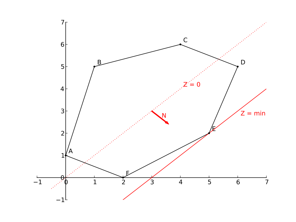 Graph of constraints for a factory production problem (feasible region highlighted). (Image: РоманСузи, CC0, via Wikimedia Commons)
4. Design Principles for Non-Spatial Visualizations
A. Separation, Order, and Alignment
- Separation: Avoid overlapping marks (e.g., jittered scatterplots).
- Order: Sort axes logically (e.g., time series from left to right).
- Alignment: Group related items (e.g., Gantt charts for project timelines).
B. Color Usage
- Rules:
- Use sequential colors for ordered data (e.g., blue→red for temperature).
- Use categorical colors for distinct groups (e.g., traffic light colors for status).
- Avoid red-green for colorblind users (use blue-yellow).
- Example: Khalti transaction status (green = success, red = failed).
## In the Real World
eSewa Transaction Analysis
- Technique: Parallel coordinates.
- How: Visualizes user type (premium/basic) vs. transaction amount vs. time to detect fraud (e.g., sudden spikes in "basic" user high-value transactions).
- Outcome: Identifies anomalies for manual review.
Daraz Order Fulfillment
- Technique: Treemap + Gantt chart.
- How: Treemap shows orders by region (size = quantity), while a Gantt chart tracks delivery timelines for each region.
- Outcome: Optimizes warehouse stock and delivery routes.
Ncell Network Traffic
- Technique: Sunburst plot.
- How: Radial plot breaks down data usage by district (angle) and time of day (radius) to identify congestion hotspots.
- Outcome: Targets infrastructure upgrades in high-traffic areas.
NEPSE Stock Analysis
- Technique: Word clouds + topic modeling.
- How: Analyzes news headlines to extract key themes (e.g., "interest rates," "global crash") and sentiment.
- Outcome: Predicts market trends for traders.
Khalti Fraud Detection
- Technique: Dendrograms + TF-IDF.
- How: Clusters transaction patterns (e.g., rapid small transfers) and flags anomalies using text analysis of user notes.
- Outcome: Reduces false positives in fraud alerts.
## Exam Tip
For Detroit Dataset (Past Question)
- Answer Structure:
- Detroit Dataset: Contains vehicle attributes (e.g., year, price, horsepower).
- Visualization: Use parallel coordinates to compare multiple attributes (e.g., price vs. mileage vs. age).
- Why? Reveals correlations (e.g., high-mileage cars cluster at lower prices).
- Answer Structure:
Hierarchical Data (Past Question)
- Key Points:
- Use treemaps/sunbursts for part-to-whole relationships.
- Dendrograms for clustering (e.g., customer segmentation).
- Example: Company org chart → Treemap with departments as top-level nodes.
- Key Points:
Text Data Levels (Past Question)
- Table:
Level Technique Example Character Glyph plots Emoji frequency in tweets Word Word clouds, TF-IDF Daraz product reviews Sentence Syntax trees Parsing bank loan applications Document Topic modeling NEPSE news sentiment analysis
- Table:
OR Models (Past Question)
- Graphical Method Steps:
- Plot constraints as lines.
- Shade feasible region.
- Find corner points.
- Evaluate objective function at corners.
- Example: Transportation problem → Use Voronoi diagrams to assign supply to demand centers.
- Graphical Method Steps:
Common Pitfalls:
- Avoid: Overlapping marks, poor color choices, ignoring axis labels.
- Do: Use annotations for key insights (e.g., "Fraud spike here").
- Formula: Always state the objective function and constraints clearly in OR problems.
## Worked Example: Kathmandu Traffic Routes
Problem: Optimize bus routes in Kathmandu to minimize travel time given:
- Constraints:
- Buses must cover Thamel, Kantipath, and Budhanilkantha.
- Max 30 buses per hour.
- Travel time: Thamel→Kantipath = 10 mins, Kantipath→Budhanilkantha = 15 mins.
- Goal: Maximize passengers served (P = 500Thamel + 300Kantipath + 200*Budhanilkantha).
Solution:
Model as LP:
- Let = buses Thamel→Kantipath, = buses Kantipath→Budhanilkantha.
- Constraints:
- (bus limit).
- .
- Objective: Maximize .
Graphical Solution:
- Plot vs. , shade feasible region.
- Corner points: (0,0), (30,0), (0,30).
- Evaluate : Max at (30,0) → .
Visualization:
Insight: Allocate all 30 buses to Thamel→Kantipath for max passengers.
## Summary Checklist
Before the exam, ensure you can:
- Draw a treemap, sunburst, and parallel coordinates plot from scratch.
- Explain the 4 levels of text data and their visualization techniques.
- Solve a linear programming problem graphically (with constraints).
- Compare hierarchical visualization techniques in a table.
- Describe how color and alignment improve clarity in non-spatial visualizations.
- Link OR models to real-world problems (e.g., Ncell network optimization).
Based on the TU BCA syllabus for Data Analysis and Visualization (CACS455), unit 4.
Discussion
Loading…