Web Technology IUnit 39 min read
Style Sheets: CSS Syntax, Selectors, Box Model, Animations & Responsive Design
Unit 3 of Web Technology I covers Cascading Style Sheets (CSS) fundamentals: syntax, selectors, box model, positioning, animations, and responsive design principles with real-world applications in Nepalese web apps like eSewa and Daraz.
TAKEAWAYS:
- CSS separates content (HTML) from presentation, improving maintainability and reusability of styles across web pages.
- The box model (content + padding + border + margin) governs element layout and spacing in web design.
- Selectors target HTML elements with specificity rules (ID > class > element) to control styling precedence.
- Responsive design uses media queries and flexible units (%, vh, vw) to adapt layouts to different screen sizes.
- Animations and transitions enhance user experience by adding motion effects to elements without JavaScript.
- CSS frameworks like Bootstrap accelerate development by providing pre-styled components and responsive grids.
Core Concepts of CSS
What is CSS?
Cascading Style Sheets (CSS) is a style sheet language used to describe the presentation of a document written in HTML. It controls layout, colors, fonts, and other visual aspects of web pages.
mindmap
  root((CSS))
    Definition
    Purpose["Separates content (HTML) from presentation"]
    Syntax["Rules: selector {property: value;}"]
    Selectors["Target HTML elements"]
    Box Model["Content + Padding + Border + Margin"]
    Positioning["Static, Relative, Absolute, Fixed, Grid, Flexbox"]
    Animations["@keyframes, transitions"]
    Responsive Design["Media queries, flexible units"]
Why use CSS?
- Maintainability: Change styles in one file to update all pages.
- Reusability: Apply the same styles across multiple pages.
- Performance: Reduces file size compared to inline styles.
- Accessibility: Improves readability and navigation for users with disabilities.
CSS Syntax and Selectors
Basic Syntax
A CSS rule consists of:
- Selector: Targets HTML elements (e.g.,
p,.class,#id). - Declaration Block: Contains one or more property-value pairs.
p {
  color: blue;
  font-size: 16px;
}
Types of Selectors
| Selector Type | Example | Description |
|---|---|---|
| Element | p |
Targets all <p> elements. |
| Class | .intro |
Targets elements with class="intro". |
| ID | #header |
Targets the element with id="header". |
| Attribute | [type="email"] |
Targets elements with type="email". |
| Pseudo-class | a:hover |
Targets links when hovered. |
| Pseudo-element | p::first-line |
Targets the first line of a paragraph. |
Example:
<p class="highlight" id="intro">Hello, Nepal!</p>
#intro {
  color: red;
}
.highlight {
  font-weight: bold;
}
Result: The text is bold and red because IDs have higher specificity than classes.
The Box Model
Every HTML element is a rectangular box with four layers:
- Content: The actual text or media.
- Padding: Space between content and border (transparent).
- Border: Edge around padding.
- Margin: Space outside the border (transparent).
Properties:
width/height: Size of the content area.padding: Space inside the border (padding: 10px 20px;).border: Style, width, and color (border: 2px solid #000;).margin: Space outside the border (margin: 15px;).
Worked Example:
.box {
  width: 200px;
  padding: 20px;
  border: 2px solid black;
  margin: 10px;
  background: lightyellow;
}
Total width calculation:
200px (content) + 40px (padding) + 4px (border) + 20px (margin) = 264px.
Positioning Elements
CSS provides five positioning schemes:
| Property | Values | Behavior |
|---|---|---|
position |
static (default), relative, absolute, fixed, grid, flex |
Controls positioning context. |
top/right/bottom/left |
Pixels or percentages | Offsets for relative, absolute, fixed. |
z-index |
Number | Stacking order (higher = closer). |
Example: Absolute Positioning
#nav {
  position: absolute;
  top: 0;
  left: 0;
  width: 100%;
}
Use Case: Fixed headers/footers or overlays (e.g., eSewa’s login popup).
CSS Animations and Transitions
Transitions
Smoothly change property values over time.
.button {
  background: blue;
  transition: background 0.3s ease;
}
.button:hover {
  background: red;
}
Keyframe Animations
Define start and end states for complex animations.
@keyframes slide {
  from { transform: translateX(0); }
  to { transform: translateX(100px); }
}
.box {
  animation: slide 2s infinite;
}
Real-World Example:
- Pathao’s Ride Animation: Uses CSS
@keyframesto show a moving dot during ride tracking. - Daraz’s Product Sliders: Transitions create smooth hover effects on product cards.
Responsive Design with Media Queries
Adapt layouts to different screen sizes using:
- Flexible Units:
%,vh,vw,rem. - Media Queries: Apply styles based on viewport width.
/* Default styles */
.container {
  width: 100%;
}

/* Tablet view */
@media (min-width: 768px) {
  .container {
    width: 80%;
  }
}

/* Mobile view */
@media (max-width: 480px) {
  .container {
    width: 95%;
    font-size: 14px;
  }
}
Example: eSewa’s Mobile-First Design
- Uses
vwunits for buttons to scale with screen width. - Media queries hide desktop menus on mobile.
CSS Frameworks: Bootstrap
Bootstrap is a popular CSS framework that provides:
- Pre-styled components (buttons, navbars, cards).
- Responsive grid system (12 columns).
- JavaScript plugins (modals, carousels).
Example Grid Layout:
<div class="row">
  <div class="col-md-4">Column 1</div>
  <div class="col-md-4">Column 2</div>
  <div class="col-md-4">Column 3</div>
</div>
Result: Three equal-width columns on medium screens (md).
In the Real World
eSewa (Nepal)
- CSS Animations: The loading spinner during payment processing uses
@keyframesfor smooth rotation. - Responsive Design: Media queries ensure the app works on both desktop and mobile devices.
- CSS Animations: The loading spinner during payment processing uses
Daraz (Nepal)
- Box Model: Product cards use
paddingandmarginto maintain consistent spacing. - Flexbox: The shopping cart dropdown menu uses
display: flexfor alignment.
- Box Model: Product cards use
Khalti (Nepal)
- Transitions: Hover effects on payment buttons use
transitionfor a polished feel. - CSS Variables: Custom properties (e.g.,
--primary-color) for consistent theming.
- Transitions: Hover effects on payment buttons use
Google (Global)
- CSS Grid: Google’s homepage uses CSS Grid for complex layouts.
- Responsive Images: Media queries serve optimized images for different devices.
NTC/Ncell Billing Portals
- Fixed Positioning: Headers and footers stay visible while scrolling (
position: fixed).
- Fixed Positioning: Headers and footers stay visible while scrolling (
Worked Example: Kathmandu Traffic Routes (Responsive Map)
Scenario: Design a responsive map for Kathmandu’s traffic routes using CSS.
<div class="map-container">
  <img src="kathmandu-map.jpg" class="responsive-map">
  <div class="route-overlay">
    <p>Thamel → Kantipath</p>
  </div>
</div>
.map-container {
  width: 100%;
  overflow: hidden;
}

.responsive-map {
  width: 100%;
  height: auto;
  display: block;
}

.route-overlay {
  position: absolute;
  top: 50%;
  left: 50%;
  transform: translate(-50%, -50%);
  background: rgba(0, 0, 0, 0.7);
  color: white;
  padding: 10px;
}

@media (max-width: 600px) {
  .route-overlay {
    font-size: 12px;
    padding: 5px;
  }
}
Result:
- On desktop: Large map with centered route overlay.
- On mobile: Smaller map with adjusted text size.
Common Pitfalls and Best Practices
| Pitfall | Solution |
|---|---|
| Specificity Wars | Use classes over IDs; avoid !important. |
| Box Model Confusion | Remember: width does not include padding/border. |
| Unresponsive Design | Test on multiple devices; use media queries. |
| Performance Issues | Minify CSS; avoid excessive animations. |
| Cross-Browser Inconsistencies | Use vendor prefixes (-webkit-, -moz-) or frameworks like Bootstrap. |
Exam Tip
Understand the Box Model: Always calculate total width/height in exams.
- Example Question: "An element has
width: 200px,padding: 10px,border: 2px, andmargin: 5px. What is its total width?" - Answer:
200 + 10 + 10 + 2 + 2 + 5 + 5 = 234px(account for left/right).
- Example Question: "An element has
Selector Specificity: Know the hierarchy (ID > class > element).
- Example:
#header phas higher specificity than.content p.
- Example:
Responsive Design: Expect questions on media queries and flexible units.
- Example: "Write a media query to apply a mobile style when the screen is less than 600px."
CSS vs. HTML: Always separate structure (HTML) from style (CSS).
Animations: Be able to write a simple
@keyframesanimation ortransition.Real-World Applications: Relate concepts to Nepalese apps (e.g., Daraz’s grid layout, eSewa’s animations).
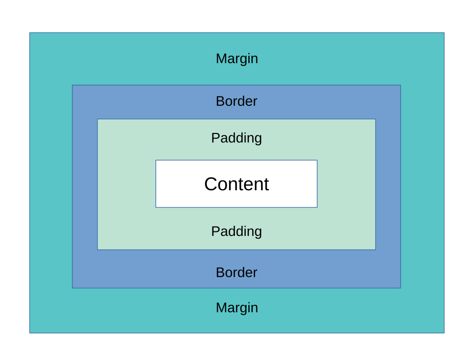 A labeled diagram showing content, padding, border, and margin layers. (Image: Charles Calvert, CC BY-SA 4.0, via Wikimedia Commons)
Based on the TU BIT syllabus for Web Technology I (BIT251), unit 3.
Discussion
Loading…