PsychologyUnit 211 min read
Perception: Processes, Theories & Real-World Applications
Unit 2 of Psychology explores how we interpret sensory information—covering perception theories, processes (attention, organization, interpretation), and real-world applications in technology, business, and daily life.
TAKEAWAYS:
- Perception is the brain’s active process of selecting, organizing, and interpreting sensory input to form meaningful experiences.
- Bottom-up processing relies on sensory data, while top-down processing uses prior knowledge and expectations.
- Gestalt principles (proximity, similarity, closure) explain how we group visual elements into coherent patterns.
- Context, culture, and individual differences (e.g., expertise) shape perception significantly.
- Applications range from UI/UX design (e.g., WhatsApp’s intuitive icons) to marketing (e.g., Daraz’s color psychology).
- Exam questions test definitions, comparisons (e.g., bottom-up vs. top-down), and real-world case studies.
What is Perception?
Perception is not just passive sensing—it’s how the brain constructs meaning from raw sensory input (e.g., light, sound, touch). Unlike sensation (the raw detection of stimuli), perception involves:
- Selection: Focusing on relevant stimuli (e.g., ignoring background noise in a crowded room).
- Organization: Grouping sensory data into patterns (e.g., recognizing a face in a crowd).
- Interpretation: Assigning meaning based on past experiences (e.g., seeing a "🚗" symbol and thinking "car").
Why it matters: Poor perception leads to errors (e.g., misreading a traffic sign) or biases (e.g., stereotyping). In tech, it dictates how users interact with apps (e.g., why Google’s search bar is always visible).
1. The Perceptual Process: From Sensation to Meaning
The journey from stimulus to perception involves three stages:
graph LR
    A["Sensory Input"] -->|"Bottom-up Processing"| B["Raw Data"]
    B -->|"Feature Detection"| C["Edges, Colors, Sounds"]
    C -->|"Parallel Processing"| D["Multiple Sensory Pathways"]
    D -->|"Top-down Processing"| E["Prior Knowledge"]
    E --> F["Interpretation"]
    F --> G["Perception: Meaningful Experience"]
Key Components:
Sensory Receptors: Convert physical energy (e.g., light) into neural signals (e.g., rods/cones in the eye).
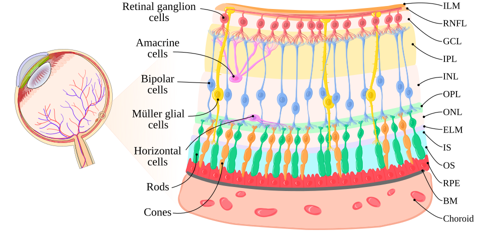 The retina’s photoreceptors (rods/cones) detect light and trigger neural signals. (Image: Bfazek, CC BY-SA 4.0, via Wikimedia Commons)
Feature Detection: The brain identifies basic features (e.g., lines, angles, motion) before assembling them into objects.
Parallel Processing: Different brain areas process color, motion, and depth simultaneously (e.g., seeing a moving red ball).
Top-Down Influences: Expectations and context shape perception (e.g., seeing a "👍" as "like" on Facebook).
Worked Example: The "Dress" Illusion (2015)
- Stimulus: A viral photo of a dress appearing blue/black or white/gold.
- Bottom-Up: The retina detects wavelengths, but the brain struggles with ambiguous lighting.
- Top-Down: Cultural background (e.g., lighting norms) biases interpretation.
- Real-World Link: Apps like Khalti use color contrast (e.g., green for "success") to guide users’ top-down expectations.
2. Gestalt Principles: How We Organize Sensory Input
The Gestalt psychologists (Wertheimer, 1920s) showed that we perceive whole patterns, not just sums of parts. Six key principles:
| Principle | Description | Example |
|---|---|---|
| Proximity | Objects close together are grouped. | Letters "OO" look like two circles, not four lines. |
| Similarity | Similar objects are grouped. | A grid of alternating black/white squares is seen as two sets. |
| Closure | We fill gaps to complete figures. | A broken circle is perceived as complete. |
| Continuity | We follow smooth, continuous paths. | Overlapping lines are seen as continuous, not intersecting. |
| Figure-Ground | One part stands out (figure), the rest fades (ground). | The Rubin vase: is it a vase or two faces? |
| Good Form | We prefer simple, symmetrical shapes. | A lopsided triangle looks "wrong" until we adjust our view. |
Real-World Application:
- UI Design: WhatsApp’s chat bubbles use proximity (grouped messages) and figure-ground (white text on colored bubbles).
- Marketing: Daraz’s ads use closure (e.g., a half-eaten burger implies satisfaction).
3. Perceptual Constancies: Why Objects "Stay the Same"
Even as sensory input changes (e.g., lighting, distance), we perceive objects as stable. Three types:
| Constancy | Definition | Example |
|---|---|---|
| Size | Objects retain perceived size despite distance. | A car looks small far away but we "know" it’s not a toy. |
| Shape | Objects retain shape despite angle/viewpoint. | A door looks rectangular even when open at an angle. |
| Brightness | Objects retain color despite lighting changes. | A white shirt looks white in sunlight or shade. |
Why it works:
- The brain compares retinal image size (how big the object appears on the retina) with distance cues (e.g., linear perspective).
- Worked Example: NTC’s traffic signs use size constancy—a small "STOP" sign far away is perceived as larger than a nearby "SLOW" sign to ensure attention.
4. Bottom-Up vs. Top-Down Processing
| Feature | Bottom-Up Processing | Top-Down Processing |
|---|---|---|
| Source | Sensory data (e.g., light waves) | Prior knowledge/expectations |
| Process | Data-driven (e.g., recognizing a "B" by its lines) | Concept-driven (e.g., reading "B" in a word) |
| Speed | Slower (requires analysis) | Faster (uses shortcuts) |
| Error-Prone | Less likely (relies on raw data) | More likely (biases can distort input) |
| Example | Seeing a "👍" for the first time | Recognizing a friend’s face in a crowd |
Real-World Example:
- Pathao’s App: Bottom-up processing helps users recognize the "ride now" button by its color/shape. Top-down processing lets experienced users tap it without looking.
- Bank ATMs: Use top-down cues (e.g., "INSERT CARD" text) to guide users even in poor lighting (bottom-up input may be unclear).
5. Perceptual Illusions: When the Brain Gets It Wrong
Illusions reveal how perception prioritizes speed over accuracy. Three classic types:
Ambiguous Figures (e.g., Rubin’s vase/faces)
- The brain can’t decide which part is figure/ground.
- Real-World Use: Nepal Rastra Bank’s logo uses symmetry to avoid ambiguity.
Distorting Illusions (e.g., Müller-Lyer illusion)
- Lines appear longer/shorter due to added fins.
- Why? The brain assumes 3D depth cues (e.g., shadows) where none exist.
- IMAGE: Müller-Lyer illusion labelled diagram | Shows how added lines distort perceived length.
Paradox Illusions (e.g., Penrose triangle)
- Impossible figures trick the brain into seeing continuity.
- Tech Link: Used in YouTube’s "loading" animations to create visual interest.
6. Context and Culture in Perception
Perception isn’t universal—it’s shaped by:
- Context: A "🚦" sign means "stop" in Kathmandu but "pedestrian crossing" in some countries.
- Culture: Color meanings vary (e.g., white = purity in Nepal, mourning in China).
- Individual Differences: Experts (e.g., chess players) perceive patterns faster than novices.
Worked Example: Kathmandu Traffic
- Bottom-Up: A driver sees a "🚦" light turn red.
- Top-Down: In chaotic traffic, some ignore it due to context (e.g., "everyone else is moving").
- Cultural Factor: In Nepal, honking is a perceptual cue for "move faster," unlike in silent European cities.
7. Applications in Technology and Business
| Industry | Application | Perceptual Principle Used |
|---|---|---|
| UI/UX Design | Intuitive app layouts (e.g., WhatsApp) | Gestalt (proximity, figure-ground) |
| Marketing | Daraz’s red "SALE" buttons | Color contrast + top-down expectations |
| Cybersecurity | CAPTCHAs (e.g., "select all traffic lights") | Bottom-up feature detection |
| Gaming | 3D graphics (e.g., GTA V) | Depth cues (linear perspective) |
| Healthcare | MRI scans (highlighting tumors) | Figure-ground contrast |
Case Study: eSewa’s Payment Interface
- Gestalt: Payment buttons are grouped (proximity) and use high contrast (figure-ground).
- Top-Down: Users expect a "PAY NOW" button in green (cultural association with success).
- Bottom-Up: The app’s OTP field uses clear typography for easy input.
8. Perceptual Errors and Biases
Even healthy brains make mistakes:
- Selective Attention: Missing the "invisible gorilla" in a video (Simons & Chabris, 1999).
- Real-World Risk: Drivers on phones miss red lights (like the NTC’s "distracted driving" campaigns warn).
- Change Blindness: Failing to notice changes in a scene (e.g., a swapped actor in a movie).
- Tech Use: Used in YouTube ads—viewers often miss subtle product placements.
- Stereotypes: Assuming all "hackers" are young males (based on media exposure).
- Bias in AI: Facial recognition fails for darker-skinned faces due to training data biases.
Exam Tip
- Definitions: Know the difference between sensation (raw input) and perception (interpretation).
- Theories: Compare bottom-up (data-driven) vs. top-down (knowledge-driven) processing.
- Gestalt Principles: Memorize the six principles and apply them to real objects (e.g., UI designs).
- Illusions: Explain one illusion (e.g., Müller-Lyer) using perceptual cues (e.g., depth assumptions).
- Real-World Links: Connect concepts to Nepali examples (e.g., traffic signs, Khalti UI) or global apps (e.g., WhatsApp, YouTube).
- Short-Answer Questions: For 5-mark questions, use the SOAP format:
- State the concept (e.g., "Gestalt’s principle of proximity").
- Offer an example (e.g., "WhatsApp’s grouped messages").
- Apply it (e.g., "This helps users scan chats quickly").
- Provide a real-world case (e.g., "Like Daraz’s product grids").
Key Formula to Remember: Perception = Sensory Input + Prior Knowledge + Context (Use this to structure answers for 10-mark descriptive questions.)
Based on the TU BIT syllabus for Psychology (PSY359), unit 2.
Discussion
Loading…