Web TechnologyUnit 49 min read
CSS Box Model, Selectors & Positioning: Styling Web Pages Like a Pro
Unit 4 of Web Technology covers CSS fundamentals—how the box model shapes elements, how selectors target content, and how positioning creates layouts. Learn to style text, control spacing, and build responsive designs using real-world examples from eSewa, Daraz, and Kathmandu traffic systems.
CSS Basics: Why Style Matters
CSS (Cascading Style Sheets) is the language that transforms plain HTML into visually appealing, interactive web pages. Without CSS, every webpage would look like a plain text document—no colors, no layouts, no user-friendly designs.
How CSS Works
CSS controls:
- Typography (fonts, sizes, colors)
- Layouts (spacing, alignment, positioning)
- Effects (shadows, transitions, animations)
- Responsiveness (adapting to mobile/desktop screens)
Real-world example:
- eSewa’s payment page uses CSS to align buttons, highlight fields, and ensure mobile compatibility.
- Daraz’s product cards rely on CSS Grid/Flexbox for consistent layouts across devices.
The CSS Box Model: The Foundation of Every Element
Every HTML element is a box with four key properties:
- Content (the actual text/image)
- Padding (space inside the box, between content and border)
- Border (the edge of the box)
- Margin (space outside the box, separating it from other elements)
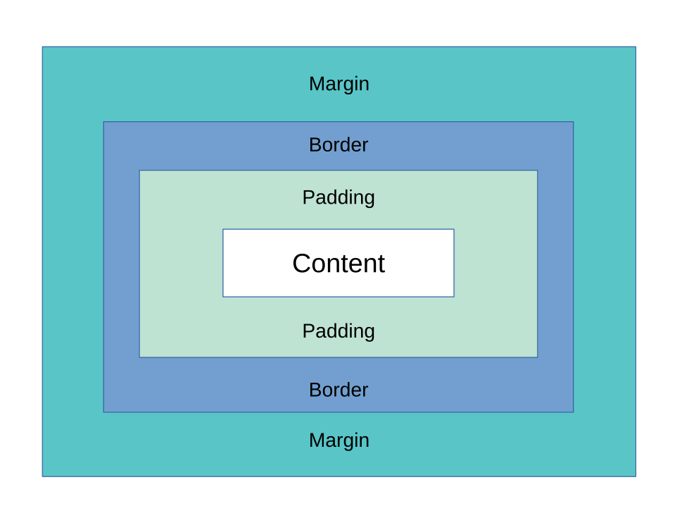
Box Model Example: A Daraz Product Card
<div class="product-card">
  <img src="product.jpg" alt="Shoes">
  <h3>Running Shoes</h3>
  <p class="price">Rs. 2,500</p>
</div>
.product-card {
  width: 200px;
  padding: 10px;       /* Space inside the box */
  border: 1px solid #ccc; /* Border around content */
  margin: 15px;        /* Space outside the box */
  background: #f9f9f9;
}
Visualization:
Key Takeaway:
- Padding affects inner spacing (e.g., text distance from edges).
- Margin affects outer spacing (e.g., gap between product cards).
- Border defines the box’s edge (e.g., Daraz’s card outline).
CSS Selectors: Targeting Elements Precisely
Selectors tell the browser which elements to style. Common types:
| Selector Type | Example | Use Case |
|---|---|---|
| Element Selector | p { color: blue; } |
Style all <p> tags. |
| Class Selector | .highlight { font-weight: bold; } |
Style multiple elements (e.g., "featured products"). |
| ID Selector | #header { background: red; } |
Style one unique element (e.g., a login form). |
| Attribute Selector | input[type="email"] |
Style inputs based on attributes. |
| Combinator | nav ul > li |
Target nested elements (e.g., menu items). |
Real-world example:
- Khalti’s checkout page uses
#payment-button(ID selector) to style the "Pay Now" button uniquely. - NTC’s website uses
.service-card(class selector) for consistent service boxes.
Positioning Elements: Absolute vs. Relative vs. Fixed
CSS position property controls where elements appear on the page.
| Position Value | Behavior | Example Use Case |
|---|---|---|
static (default) |
Follows normal document flow. | Default text alignment. |
relative |
Moves relative to its original place. | Adjusting a Daraz filter sidebar. |
absolute |
Positions relative to nearest positioned ancestor. | Overlaying a "Sold Out" badge. |
fixed |
Stays in the same place on scroll. | Sticky "Back to Top" button. |
sticky |
Hybrid of relative + fixed. |
Floating header on NEPSE’s stock page. |
Worked Example: Kathmandu Traffic Routes (Absolute Positioning)
Imagine a map where traffic signals are positioned absolutely:
<div class="map">
  <div class="signal" id="signal1" style="position: absolute; top: 100px; left: 200px;">⚠️</div>
  <div class="signal" id="signal2" style="position: absolute; top: 300px; left: 400px;">⚠️</div>
</div>
.map {
  width: 600px;
  height: 600px;
  border: 1px solid black;
  position: relative; /* Required for absolute children */
}
Visualization:
Exam Tip:
- Always set
position: relativeon a parent if usingabsolutechildren. fixedelements stay in place even when scrolling (e.g., WhatsApp’s floating chat button).
CSS Shadow Effects: Adding Depth
Shadows create 3D effects or highlight important elements.
.box {
  box-shadow: 10px 10px 5px #888888; /* horizontal | vertical | blur | color */
  text-shadow: 2px 2px 4px rgba(0,0,0,0.5); /* for text */
}
Real-world example:
- Pathao’s ride request button uses
box-shadowto make it pop. - Ncell’s notification badge uses
text-shadowfor readability.
Internal vs. External CSS: Best Practices
| Type | Definition | Example | Pros | Cons |
|---|---|---|---|---|
| Internal | CSS inside <style> in HTML. |
<style> p { color: red; } </style> |
Quick for small projects. | Hard to maintain. |
| External | CSS in a separate .css file. |
<link rel="stylesheet" href="styles.css"> |
Reusable, faster loading. | Requires file management. |
Best Practice:
- Use external CSS for large projects (e.g., Daraz, eSewa).
- Use internal CSS for quick prototypes or single-page sites.
In the Real World
eSewa’s Payment Page
- Uses CSS Grid for aligning input fields (
username,password) and buttons. - Box Model: Padding ensures text isn’t cramped; margins separate fields.
- Positioning: The "Submit" button is
position: fixedat the bottom.
- Uses CSS Grid for aligning input fields (
Daraz’s Product Search
- Selectors:
.product-cardstyles all product boxes uniformly. - Shadows:
box-shadowadds depth to "Hot Deals" sections. - Responsive Design: Media queries adjust layouts for mobile.
- Selectors:
NTC’s Service Portal
- Absolute Positioning: Dropdown menus appear relative to their buttons.
- External CSS:
styles.cssis linked across all pages for consistency.
Exam Tip: How to Score Full Marks
Box Model Questions
- Always draw a box diagram (like the one above) to explain padding/border/margin.
- Example answer for "Describe CSS Box Model":
The CSS Box Model consists of content (text/image), padding (inner spacing), border (edge), and margin (outer spacing). For a
<div>withpadding: 20px; border: 2px solid black; margin: 10px;, the total width =content + padding (40px) + border (4px) + margin (20px).
Selector Questions
- Use tables to compare selectors (like the one above).
- For "How to style a button with ID
submit-btn?":#submit-btn { background: green; padding: 10px 20px; }
Positioning Questions
- Trace the flow: If asked to position a
<div>absolutely, show:- Parent must have
position: relative. - Child uses
top/leftvalues.
- Parent must have
- Example:
<div class="container" style="position: relative;">
  <div class="overlay" style="position: absolute; top: 50px; left: 50px;">Hello!</div>
</div>
- Trace the flow: If asked to position a
Real-World Scenarios
- Tie answers to eSewa/Khalti/Daraz. For example:
"How would you style a Daraz product card?" Use
.product-card { display: grid; gap: 15px; box-shadow: 0 4px 8px rgba(0,0,0,0.1); }for a modern look.
- Tie answers to eSewa/Khalti/Daraz. For example:
Practice Questions (Exam-Style)
Box Model Calculation If a
<div>haswidth: 300px; padding: 20px; border: 5px; margin: 10px;, what is its total width?Answer:
300 + 20 + 20 + 5 + 5 + 10 + 10 = 370px(left + right padding/border/margin).Selector Challenge Write CSS to:
- Style all
<p>tags with classnotein red. - Style the element with ID
headerto be blue.
p.note { color: red; } #header { color: blue; }- Style all
Positioning Layout Create a layout where:
- A
<div>with IDsidebaris fixed on the left (width: 200px). - Content fills the rest (
position: absolute; right: 0).
<div class="container" style="position: relative;"> <div id="sidebar" style="position: fixed; left: 0; width: 200px;">Menu</div> <div id="content" style="position: absolute; right: 220px;">Main Content</div> </div>- A
Based on the TU BSc CSIT syllabus for Web Technology (CSC318), unit 4.
Discussion
Loading…