StatisticsUnit 712 min read
Sampling Techniques & Data Presentation: Frequency, Ogives, Box-Plots
Unit 7 of Statistics covers sampling methods (probability vs. non-probability), frequency distributions, ogives (less-than/more-than), and box-and-whisker plots, with real-world applications in tourism data analysis, revenue forecasting, and customer satisfaction surveys.
TAKEAWAYS:
- Sampling divides into probability (random, stratified, systematic) and non-probability (convenience, judgmental) techniques—choose based on budget, time, and accuracy needs.
- Frequency distributions organize raw data into classes (e.g., age groups of tourists) and calculate relative frequencies and cumulative frequencies for deeper insights.
- Ogives (cumulative frequency curves) visually locate median, quartiles, and percentiles—critical for income distribution analysis in tourism businesses.
- Box-and-whisker plots reveal spread, skewness, and outliers in datasets (e.g., hotel rating scores or flight delay times) using the five-number summary.
- Primary vs. secondary data: Primary is firsthand (surveys, experiments) while secondary is pre-existing (government reports, NTC traffic data)—each has trade-offs in cost and reliability.
- Real-world tie: Pathao’s driver earnings use frequency distributions to classify income brackets, while Nepal Tourism Board’s visitor surveys rely on stratified sampling for regional accuracy.
1. Sampling Techniques: How to Select Your Data
Sampling is the process of selecting a representative subset from a population to estimate characteristics of the whole. Poor sampling leads to biased results—e.g., a Kathmandu traffic survey ignoring Pokhara would misrepresent national trends.
Types of Sampling
mindmap
  root((Sampling Techniques))
    Probability Sampling
      Random: Every unit has equal chance (e.g., lottery for 100 hotel guests)
      Stratified: Divide population into subgroups (e.g., tourists by nationality: Indian, Chinese, Western)
      Systematic: Select every *k*-th unit (e.g., every 10th arrival at Tribhuvan Airport)
      Cluster: Divide into clusters, sample entire clusters (e.g., survey all hotels in Kathmandu, then all in Pokhara)
    Non-Probability Sampling
      Convenience: Easiest to reach (e.g., surveying students in TU campus—ignores rural tourists)
      Judgmental: Expert picks samples (e.g., tourism ministry selects "representative" destinations)
      Quota: Fill predefined quotas (e.g., 30% Indian, 20% Chinese tourists)
Key Comparisons
| Criteria | Probability Sampling | Non-Probability Sampling |
|---|---|---|
| Representativeness | High (statistically valid) | Low (biased) |
| Cost | High (time-consuming) | Low (quick) |
| Use Case | Academic research, legal surveys | Pilot studies, quick market feedback |
Worked Example 1: Stratified Sampling for Tourism Problem: A hotel chain wants to survey guest satisfaction across 3 star categories (1-star, 3-star, 5-star). Population = 5000 guests (1000 per category). Sample size = 200. Solution:
- Stratify by star rating.
- Allocate proportionally:
- 1-star: guests
- 3-star: 80 guests
- 5-star: 80 guests
- Randomly select 40 from 1-star, etc. Why? Ensures each category is represented—critical for fair comparisons.
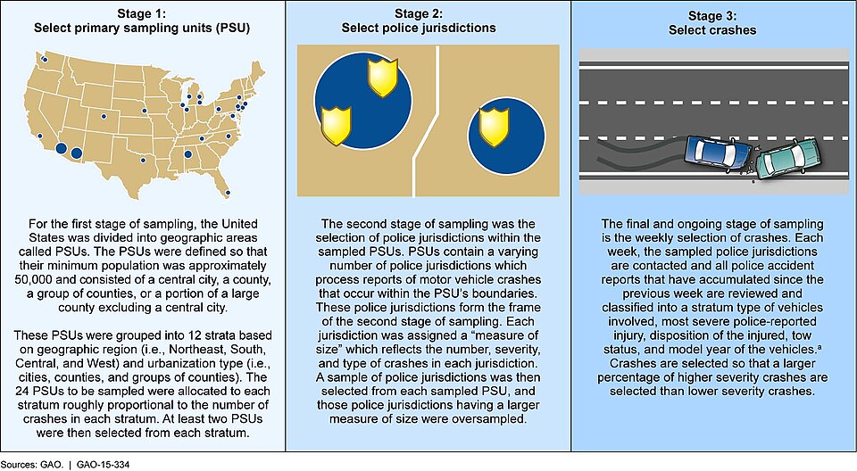 Stratified sampling divides population into homogeneous subgroups before random selection. (Image: U.S. Government Accountability Office from Washington, DC, U, Public domain, via Wikimedia Commons)
2. Data Presentation: Frequency Distributions
Raw data (e.g., daily tourist arrivals at Pokhara) is unusable without organization. Frequency distributions group data into classes (intervals) and count occurrences.
Steps to Construct a Frequency Distribution
- Find the range: .
- Choose class intervals: Typically 5–12 classes, width = .
- Tally frequencies: Count data points in each class.
Worked Example 2: Tourist Arrivals by Age
Data: Ages of 30 tourists visiting Chitwan National Park:
25, 32, 45, 28, 30, 40, 52, 22, 35, 48, 20, 33, 42, 50, 27, 31, 44, 55, 24, 36, 47, 51, 29, 34, 46, 53, 26, 37, 49, 54
Solution:
- Range = 55 – 20 = 35.
- Classes (6 intervals): 20–24, 25–29, ..., 50–54.
- Frequency table:
| Age Group | Frequency (f) | Relative Frequency (%) | Cumulative Frequency |
|---|---|---|---|
| 20–24 | 3 | 3 | |
| 25–29 | 6 | 20% | 9 |
| 30–34 | 5 | 16.7% | 14 |
| 35–39 | 4 | 13.3% | 18 |
| 40–44 | 5 | 16.7% | 23 |
| 45–49 | 4 | 13.3% | 27 |
| 50–54 | 3 | 10% | 30 |
Visualization:
Key Terms:
- Class midpoint: (e.g., for 20–24: 22).
- Relative frequency: .
- Cumulative frequency: Running total (used for ogives).
3. Ogives: Locating Median and Quartiles
An ogive (cumulative frequency curve) plots cumulative frequencies against class boundaries. It helps find:
- Median (50th percentile)
- Quartiles (25th, 75th percentiles)
- Percentiles (e.g., income of top 10% earners)
Types of Ogives
- Less-than ogive: Plots cumulative frequency below the upper limit.
- More-than ogive: Plots cumulative frequency above the lower limit.
Worked Example 3: Hotel Rating Scores
Data: Ratings (out of 10) for 20 hotels in Pokhara:
7, 8, 6, 9, 5, 8, 7, 6, 9, 8, 7, 6, 5, 9, 8, 7, 6, 5, 4, 8
Solution:
- Frequency table:
| Rating | Frequency (f) | Cumulative Frequency |
|---|---|---|
| 4–5 | 3 | 3 |
| 5–6 | 4 | 7 |
| 6–7 | 5 | 12 |
| 7–8 | 5 | 17 |
| 8–9 | 3 | 20 |
Less-than ogive:
- Plot points at (5, 3), (6, 7), (7, 12), (8, 17), (9, 20).
- Draw a smooth curve.
Find median:
- .
- Locate 10 on y-axis → intersects at rating ≈ 7.
Real-World Tie: Nepal Tourism Board uses ogives to analyze visitor satisfaction scores across regions. For example, if the median rating for Pokhara is 7 but for Kathmandu it’s 6, it signals a quality gap needing investigation.
4. Box-and-Whisker Plot (Box Plot)
A box plot summarizes data using the five-number summary:
- Minimum
- First quartile (Q1, 25th percentile)
- Median (Q2, 50th percentile)
- Third quartile (Q3, 75th percentile)
- Maximum
Steps to Construct:
- Order data: .
- Find Q1, Q2 (median), Q3.
- Draw a box from Q1 to Q3, median line inside.
- Whiskers extend to min/max (excluding outliers).
Worked Example 4: Flight Delay Times (minutes)
Data: Delays for 15 flights from Kathmandu to Pokhara:
5, 8, 10, 12, 14, 15, 16, 18, 20, 22, 25, 30, 35, 40, 60
Solution:
- Ordered data: Already sorted.
- Five-number summary:
- Min = 5
- Q1 (25th percentile) = 12th value = 15
- Median (Q2) = 8th value = 18
- Q3 (75th percentile) = 12th value = 30
- Max = 60
- Box plot:
- Box: 15 to 30
- Median line at 18
- Whiskers: 5 to 60
- Outlier? 60 is beyond (where IQR = 30 – 15 = 15 → threshold = 30 + 22.5 = 52.5). So, 60 is an outlier.
Interpretation:
- Skewness: Median (18) is closer to Q1 (15) than Q3 (30) → right-skewed (some flights have extreme delays).
- Spread: IQR = 15 → moderate variability.
- Outliers: 60-minute delay may need investigation (e.g., weather, technical issues).
Real-World Tie: NTC (Nepal Telecom) uses box plots to analyze call wait times across regions. A box plot showing longer whiskers in rural areas helps them target infrastructure upgrades.
5. Primary vs. Secondary Data
| Criteria | Primary Data | Secondary Data |
|---|---|---|
| Source | Collected firsthand (surveys, experiments) | Existing (reports, databases) |
| Cost | High (time, labor) | Low |
| Relevance | Highly specific to research needs | May not fit perfectly |
| Example (Tourism) | Surveying tourists at Swayambhunath | Using NTA’s annual visitor reports |
Worked Example 5: Choosing Data for a Study Problem: A travel agency wants to analyze customer preferences for eco-tourism.
- Primary data: Conduct a survey of 500 past customers (costly but precise).
- Secondary data: Use NTA’s 2023 report on eco-tourism trends (cheap but outdated).
Decision:
- Use secondary data for initial trends.
- Supplement with primary surveys for local preferences.
In the Real World
Pathao’s Driver Earnings
- Idea: Frequency distributions
- How: Pathao classifies driver earnings into brackets (e.g., Rs. 10k–20k, 20k–30k) to analyze income inequality among drivers. A skewed distribution (e.g., most drivers in Rs. 10k–20k) prompts bonus incentives for high performers.
Nepal Tourism Board’s Visitor Surveys
- Idea: Stratified sampling
- How: To survey 10,000 tourists, they stratify by:
- Nationality (Indian, Chinese, Western)
- Destination (Kathmandu, Pokhara, Chitwan)
- Purpose (leisure, business, pilgrimage)
- Ensures no subgroup is underrepresented (e.g., Chinese tourists in Kathmandu).
Daraz’s Order Fulfillment
- Idea: Box-and-whisker plots
- How: Daraz tracks delivery times across warehouses. A box plot reveals:
- Median delivery: 48 hours
- Outliers: Some orders take >72 hours (triggering logistics audits).
- Helps set realistic delivery promises to customers.
Exam Tip
Sampling Questions:
- Always define the population and sampling frame.
- For stratified sampling, show proportional allocation (e.g., "Indian tourists = 60% of sample").
- Avoid: Judgmental sampling unless the question specifies "expert selection."
Frequency Distributions:
- Class intervals must be mutually exclusive and equal width.
- Relative frequency is often asked—always calculate it.
- Exam trick: If data is discrete (e.g., number of tourists), use exclusive classes (e.g., 0–4, 5–9). For continuous (e.g., height), use inclusive (e.g., 150–159).
Ogives:
- Plot cumulative frequency on the y-axis (not frequency).
- Median is where the ogive crosses the 50th percentile line.
- Always label the median value on the graph.
Box Plots:
- Five-number summary is mandatory—show calculations.
- Outliers: Use the formula or .
- Skewness: If median is closer to Q1 → right-skewed; closer to Q3 → left-skewed.
Common Mistakes to Avoid:
- Forgetting cumulative frequency in ogives.
- Incorrect class boundaries (e.g., overlapping intervals).
- Ignoring units in box plots (always label axes).
- Primary vs. secondary confusion: Primary is original data; secondary is someone else’s data.
Pro Tip: For past exam questions on ogives or box plots, always sketch the graph—even if not asked, it helps visualize the solution. For example, in the hotel rating ogive, drawing the curve makes the median calculation intuitive.
Based on the TU BTTM syllabus for Statistics (STT301), unit 7.
Discussion
Loading…